Redesigning Happy Coding Part 2


Redesigning Happy Coding Part 2
- I like to move it move it
- The Next Chapter
- New Left Nav
- New Right Nav
- Responsive
- Home Sweet Home
- My Hero
- Meta-Tutorials
- It’s my party and I’ll obsess over CSS if I want to
- TODO
- Summary
A few weeks ago, I mentioned in part one of this blog post that I was thinking about redesigning Happy Coding. I wanted to make the tutorials and examples feel more cohesive, and I wanted to make it more obvious (to visitors, and to myself) what Happy Coding is all about.
As often happens, I managed to nerd snipe myself with that blog. I spent the last month moving stuff around, breaking everything, obsessing over CSS, and thinking about this site way too much- but what else is new?
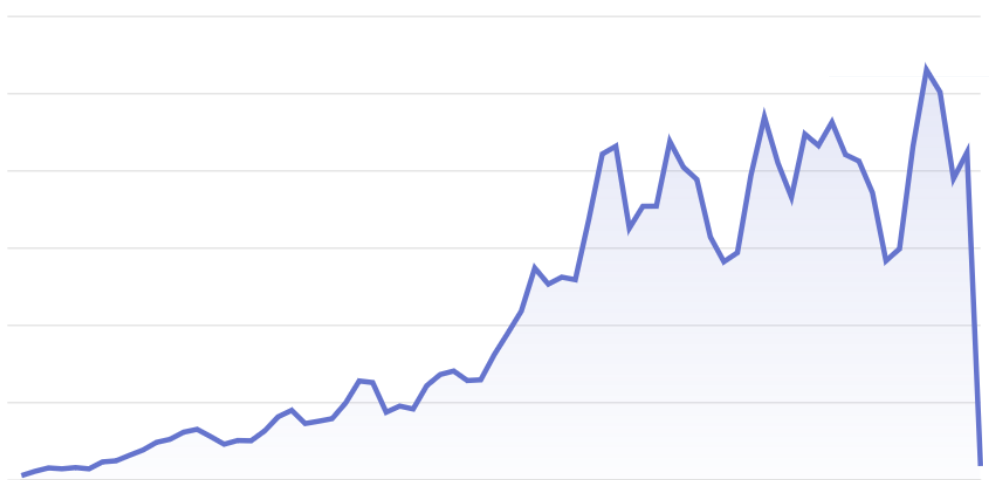
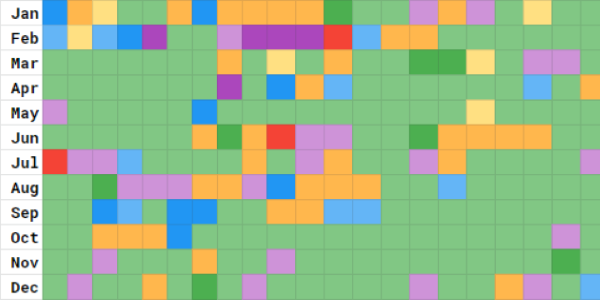
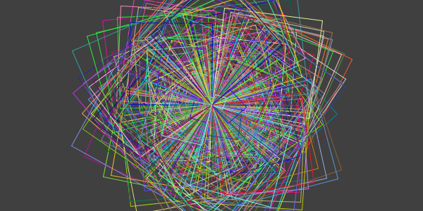
Here’s a timelapse of the screenshots I took along the way:
If you’re interested in the nitty gritty details, read on!
I like to move it move it
One of the main things I wanted to fix with this redesign was that the tutorials and examples felt disconnected. I started by moving all of the examples to be sub-pages of tutorials- for example the circle packing example is now nested underneath the creating classes tutorial.
I didn’t technically need to do this, but it felt like a prerequisite for everything else. I often feel this way, where I need to do things in a certain order for them to make sense.
I used Jekyll’s redirect_from feature to make sure that old links still worked. Then to make sure the embedded comments didn’t generate a bunch of forum spam, I set the discourseEmbedUrl of every moved page (more on this later). I spent a solid three weeks just moving pages, setting their redirect_from and discourseEmbedUrl properties, updating links to them, and then moving their associated image files. This was pretty tedious, but I’m glad it’s done!
The Next Chapter
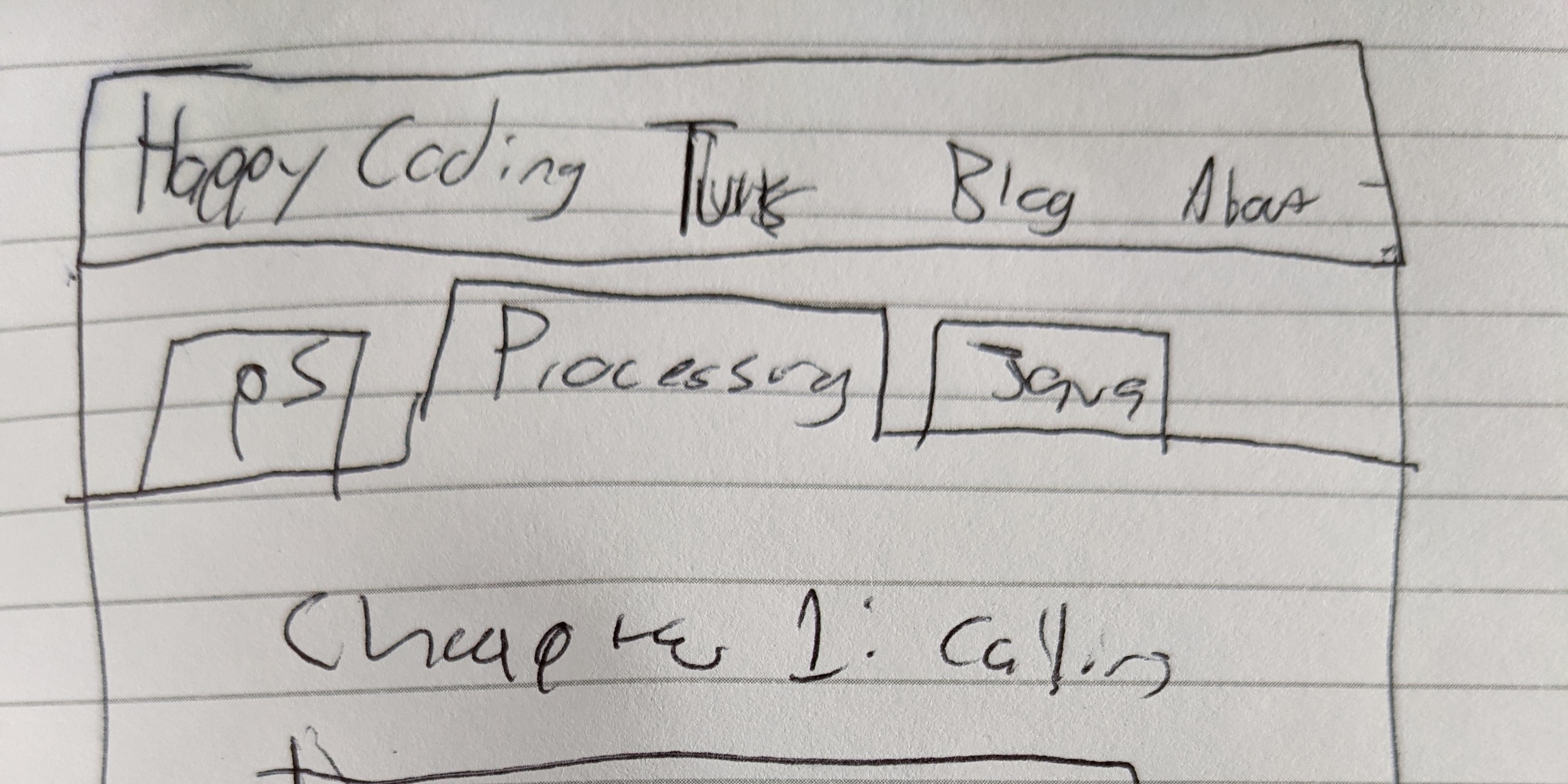
After I had the examples moved to be sub-pages of the tutorials, I redesigned the top-level tutorial pages to make that relationship more obvious by grouping tutorials and examples into what I’m calling chapters.
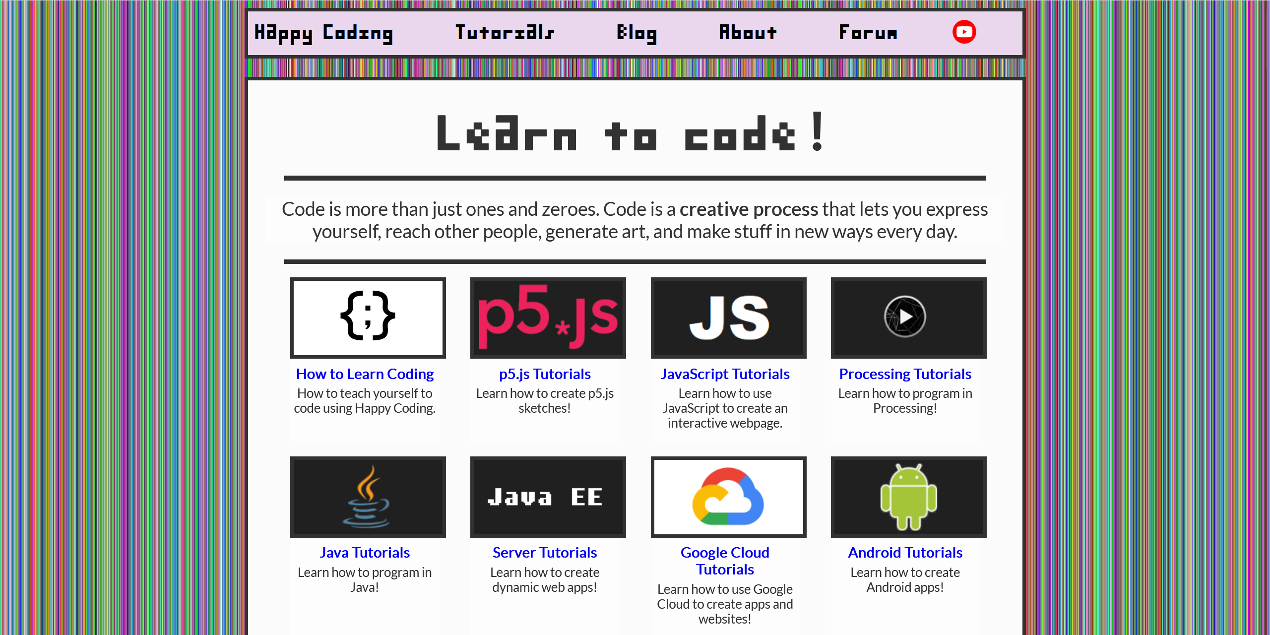
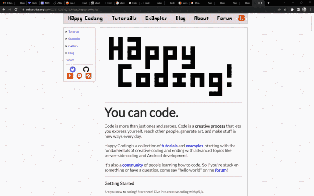
Here’s what the p5.js tutorials page looked like before:
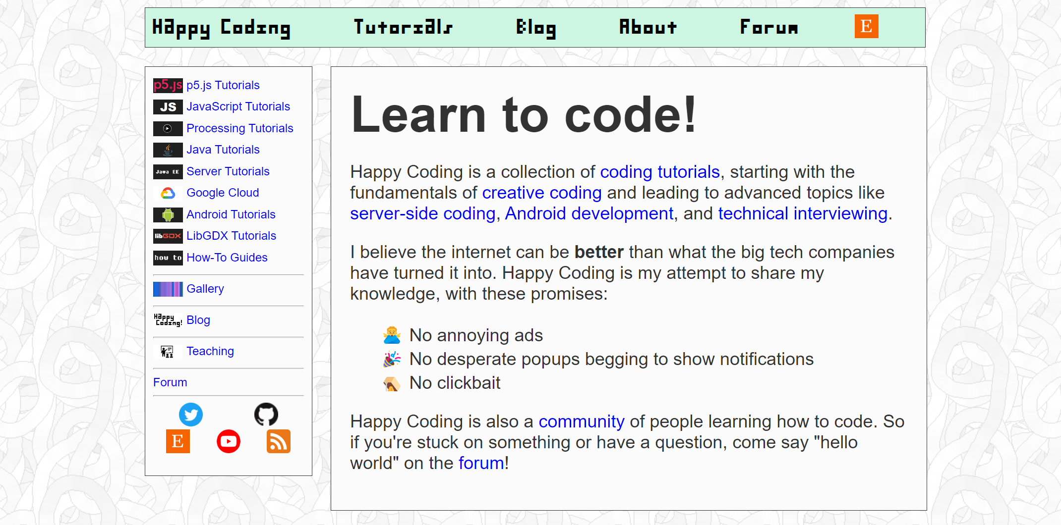
And here’s what it looks like now:
When I wrote part 1 of this blog post, I was obsessing over exactly how to group this page. Making a Jekyll include that showed examples for a given tutorial was helpful, because it meant I could show examples for every tutorial with just one line of code. But I ended up spinning my tires on this quite a bit, and my “ah-ha” moment finally came when I added images to the left nav.
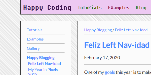
New Left Nav
Pretty much every post on Happy Coding has an associated thumbnail image, which has been a source of mild annoyance for me- when I write a new post, creating the thumbnail often takes longer than writing the post itself! But on the bright side, this made it pretty easy to give every post a unique and more interesting presence in the left nav.
I also added these thumbnails to the breadcrumb at the top of most pages. I might add them to inline links, but for now I’m pretty happy with how they look in the left nav.
I was a little worried that including all of these images on a single page would significantly increase the page size. For example, the p5.js tutorials page (which contains the most images) has grown from about 2.5 MB to about 9.5 MB. But to put that in perspective, loading Twitter (without scrolling at all) is about 12.5 MB. So I’m telling myself I’m still within a reasonable boundary.
New Right Nav
As I was staring at the left nav, it occurred to me that I could add a right nav that contained an interactive table of contents that showed where you were in the page. Some of the tutorials are pretty long, and I know I should probably break them down into smaller posts. But hopefully the right nav helps orient readers so they know where they are in the article.
I thought about doing this myself, and Sticky Table of Contents with Scrolling Active States on CSS-Tricks was super helpful. But in the end I went with a library called Tocbot.
Eventually I might add other stuff to the right nav, but for now I’m pretty happy with the new interactive table of contents. In fact, I’ve already found myself using it pretty often. It’s always a cool feeling when something I make is actually useful, even if it’s only useful for myself!
Responsive
Happy Coding has always been responsive, where the page has a different layout depending on how wide the screen is. But I’ve gone back and forth on exactly where the breakpoints should be, and it’s changed a few times over the years.
Revamping the left nav and adding the right nav gave me an excuse to obsess over revisit Happy Coding’s responsive layout logic. After a ton of CSS fiddling, Happy Coding now has this responsive behavior:
- For phones (width less than 500), tutorial thumbnails take up the whole width of the screen, and the left and right navs are hidden.
- For small browsers (width at least 500), tutorial thumbnails are shown at their normal widths of 200 pixels. In other words, if a device can’t show two thumbnails next to each other, it increases their size to be easier to see.
- For medium browsers (width at least 840), the core content (the text itself) snaps to be 750 pixels wide, and the container (the outer rectangle containing everything except the background) snaps to 800 pixels.
- For large browsers (width at least 1090), the left nav appears, and the container increases to 1050 pixels.
- For extra large browsers (width at least 1340), the right nav appears, and the container increases to 1300 pixels.
According to Google Analytics, only 4% of Happy Coding’s visitors have a screen width less than 1280. And only about 10% have a screen width less than 1300. The vast majority have screen widths that would fall under what I’m calling “extra large”. But making Happy Coding responsive makes it easier for folks to put a tutorial on one half of the screen and a code editor on the other half, for example.
Try changing the width of your browser window to see the responsive layout in action!
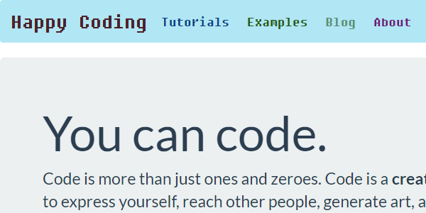
Home Sweet Home
Next, I revamped the homepage. I wanted to make sure that new folks understood right away what makes Happy Coding unique. I split the homepage up into sections so that it wasn’t just a big wall of text.
Here’s the homepage before and after:
My Hero
The left nav revamp got me thinking about what else I could do with the thumbnails on every post. They’ve been annoying to add, so I might as well use them, right?
I played around with the idea of adding a hero image to every post- that’s the big image at the top of a webpage that supposedly draws the reader in. I personally find them mildly annoying, but there’s an interesting meta-communication thing going on here. Most “real” websites use hero images, so if I want people to think of Happy Coding as a “real” website, including a hero image communicates that to the viewer.
I could go down a rabbit hole thinking about this meta-communication cycle and whitewashing of the internet, but for now I don’t hate the hero images as much as I thought I would.
Here’s the before and after:
Meta-Tutorials
One of my main goals with this redesign was to refocus on the community aspect of Happy Coding. I moved the examples to be sub-pages of the tutorials so that people would have more of a connection with the content, for example.
With that in mind, I also added two meta-tutorials that walk through becoming more involved in the site:
How to Subscribe to Happy Coding talks about staying up to date as I post new stuff to the site. I’m trying to find ways to connect with folks outside of social media, and hopefully this is a step in that direction.
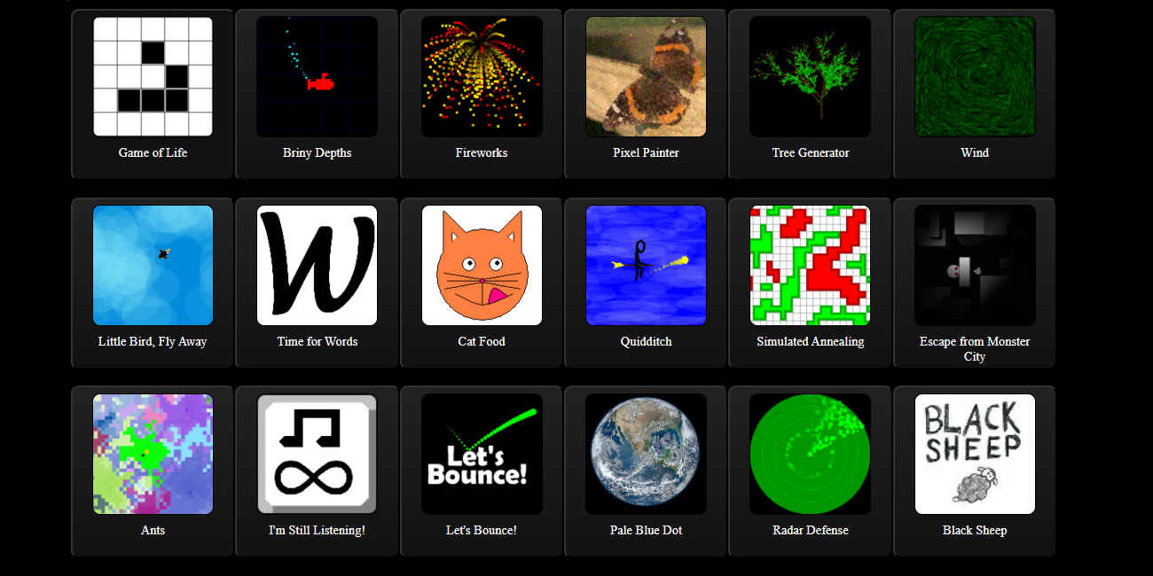
How to Add Your Own Example explains the process for adding your own code examples and remixes to Happy Coding. I also added a link to this to every example box- another perk of that Jekyll include thing I mentioned above. Here’s what it looks like:
Using Variables Examples


It’s my party and I’ll obsess over CSS if I want to
Parts of this process were tedious and sometimes frustrating, but I was reminded of a specific feeling I get when working on Happy Coding: the joy of having the freedom to work on whatever the heck I want. I’ve been pretty frustrated with my day job for a while, so it was nice to focus on things just because I found them interesting, without needing to run everything by a committee or get signoff from somebody else.
So even though spending an entire day debating whether margins should be 25px or 23px might not sound particularly joyous, the fact that I could spend my day doing it without getting anybody else’s permission was a reminder of why I do this in the first place.
TODO
I’m at a point where I’m calling the redesign done, but just like everything else, it’ll never really be done.
I still need to comb through the site for old links, which work but should be updated anyway. I also might add the new meta-tutorials in more places, maybe the left or right navs.
There are some interesting questions to answer if / when folks submit their own examples: How do I decide what to accept? How do I differentiate “official” posts from user-submitted content? How do I give proper attribution?
The sub-page approach opens up some other questions: Should I split some of the longer tutorials up into multiple pages? What would that structure look like? Or is there value in sticking to the “long form” approach?
There’s also an ongoing issue with the move: apparently somebody out there is running a local version of the site that’s synced to the narrow window after I moved the example pages, but before I fixed the Discourse embed code. As they navigate around their local copy of the site, the forum has been creating new posts instead of reusing the existing ones. I’m actually not sure if there’s a way to fix this other than to break the old links entirely, so for now I’ve unlisted new embedded posts. It’s sorta touching that somebody out there is running a local version of the site, even if it is annoying!
Summary
I’m pretty happy with the results. Nesting the examples under the tutorials feels more correct, and the left nav is definitely more inviting. I’m hoping this helps folks connect with Happy Coding. If you’re a folks and have some feedback on the redesign or just want to say hi, don’t hesitate to comment below or introduce yourself in the Happy Coding forum!