Homepage Update


Homepage Update
Happy Coding has a new (-ish) homepage! See it here: HappyCoding.io
I’ve wanted to redesign the homepage for a while now. The last site redesign was back in 2022, and it mostly focused on the directory structure of tutorials, along with the introduction of left and right navigation bars.
I pretty openly hate the idea of worrying about SEO or “engaging” “users”, but web design involves a weird cultural communication phenomenon, where people expect to see certain patterns in the sites they visit. If those patterns aren’t present, people tend to dismiss the site regardless of the content.
To see what I mean, take a look at CERN’s first website from 2001:
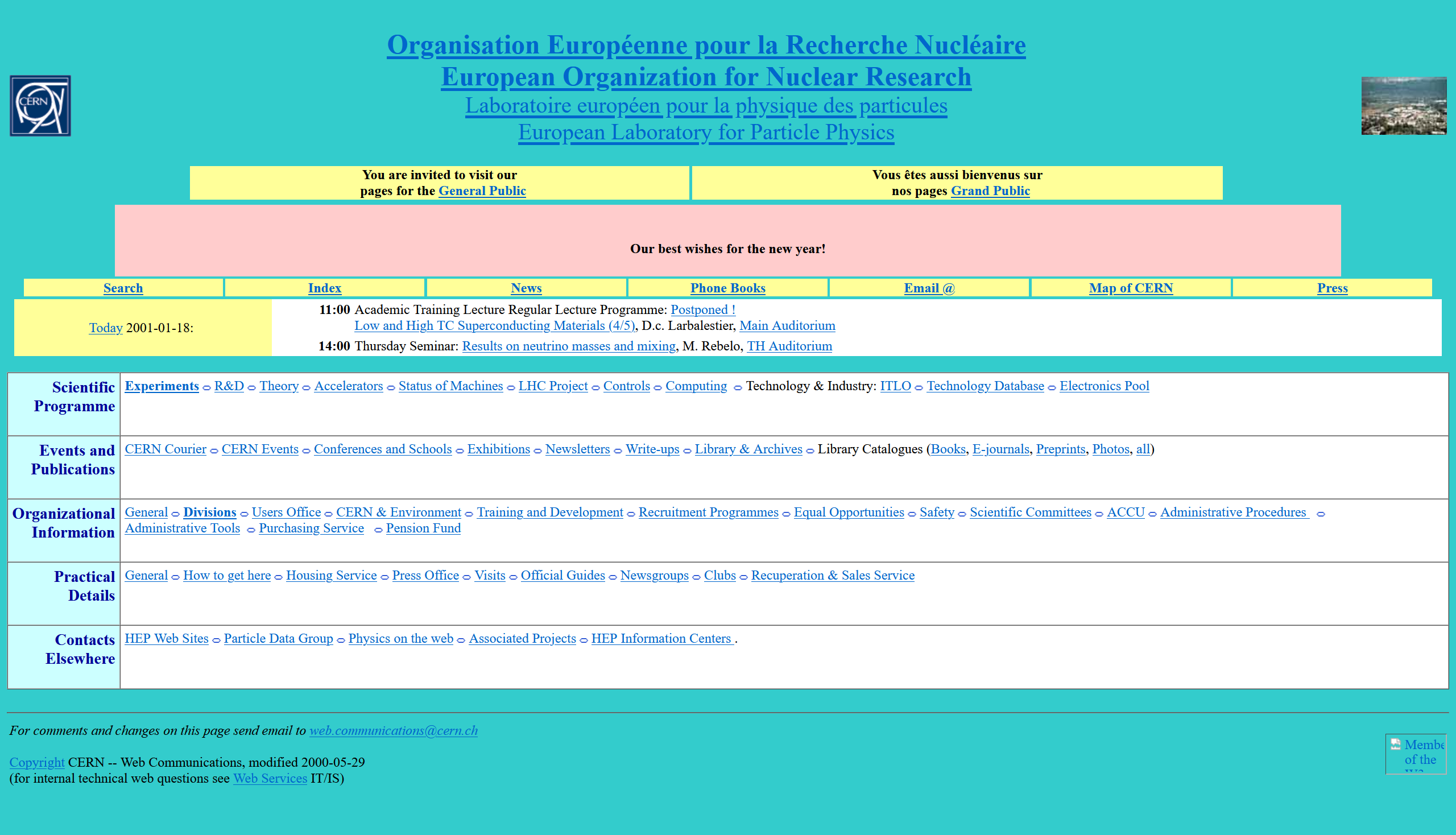
(Thank you Wayback Machine!)
What are your initial thoughts when you see this page? If you landed here from a search engine, would you click around more, or would you hit the back button? Why?
If you’re like most people, you’d assume that whoever made this website is an unprofessional amateur, and that the content on any subsequent pages isn’t worth your time. You’d likely hit the back button and keep looking for something that looks more “official”.
The funny thing is, CERN is super official, even back on this early webpage. It’s where the internet was invented, for Tim’s sake!
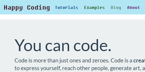
But compare that to CERN’s current homepage:
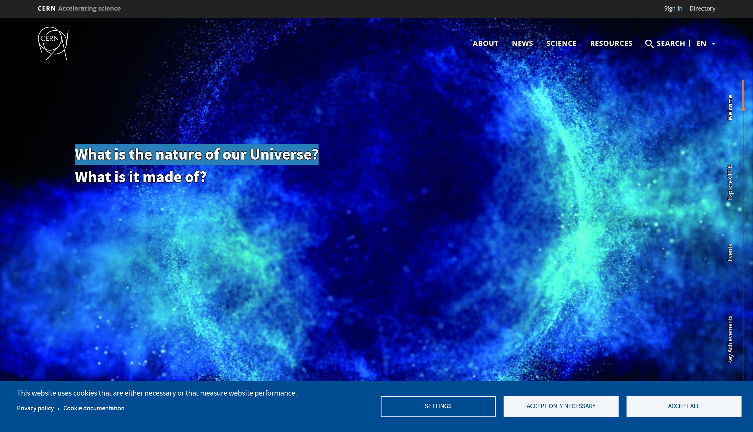
Something about this feels more official. This is a real website. It’s got a big hero image, and you know you have to scroll down to get to a bunch of stylized sections that explain how important the page you’re looking at is. It’s even got a cookie notification!

Joking aside, I admit that this effect is real, and I’m not immune to it. As much as I wish don’t judge a book by its cover was true, and as much as I love what some folks are doing with the old web aesthetic (see Max Bittker and Everest Pipkin for examples), the fact is that following modern design patterns communicates something to the people looking at your website.
Getting Started
All of that has been bouncing around in my brain for a long time now, but I’ve been busy teaching and moving and procrastinating because honestly updating the homepage to be more “modern” sounded pretty boring.
But as I slowly emerged from my cave over the past few weeks, I started tinkering with the homepage. And once I start tinkering with something, I can’t really stop until it’s finished. (Sorry Genuary, I’ve got a homepage to redesign!)
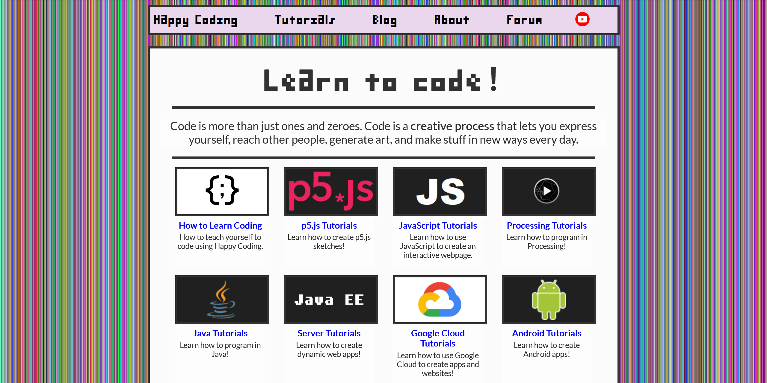
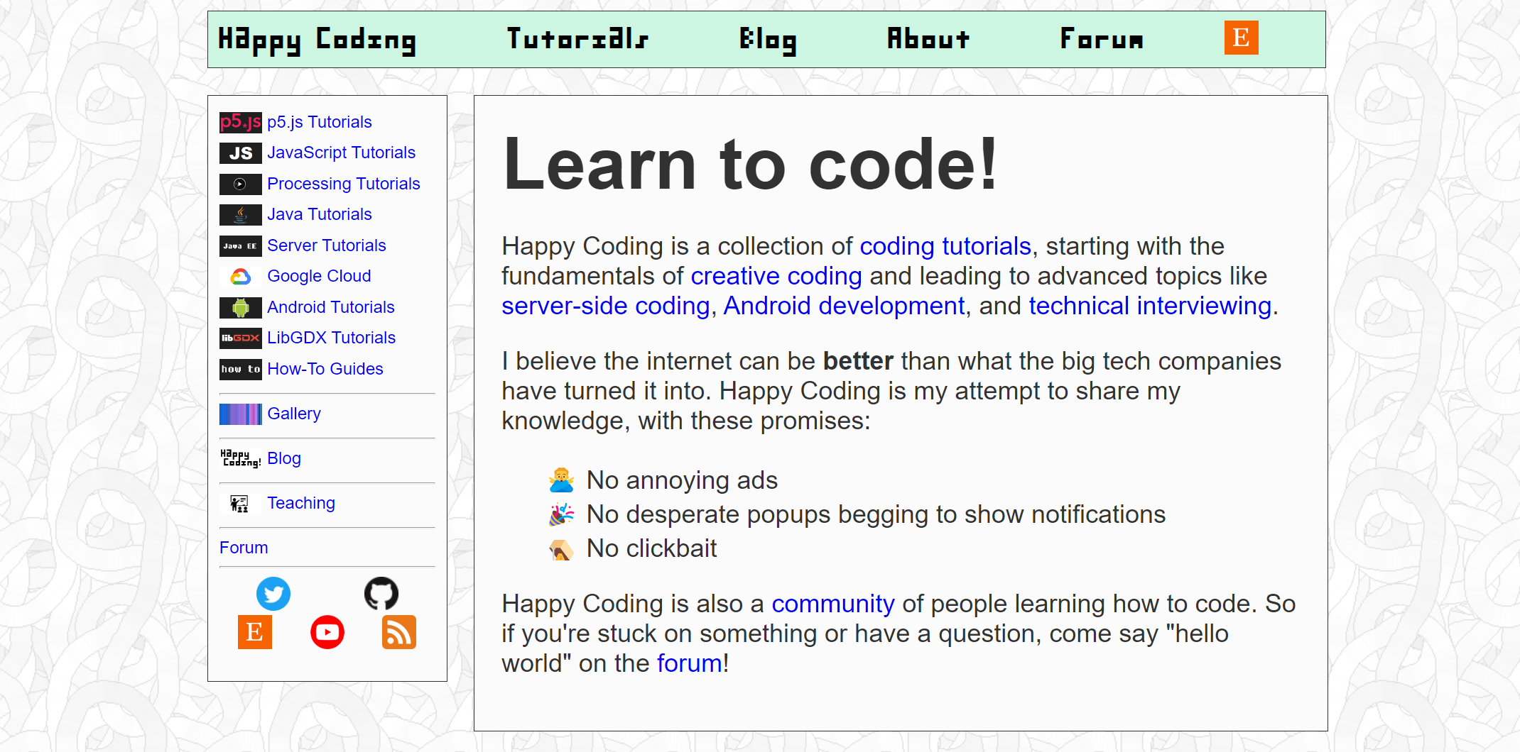
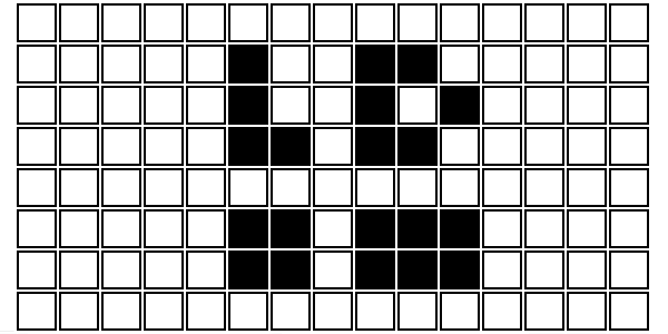
Here’s what the homepage looked like before I made any changes:
At the risk of getting defensive in my own blog post, I don’t think this homepage is bad, but I don’t think it communicates what I want it to.
I had a rough plan that involved some combination of the following:
- Split the homepage into more obvious sections
- Make each section take up the whole width, and maybe the whole height
- Give each section its own style and background
- Each section should have some text next to some images, but the layout should vary from section to section
- While we’re at it, let’s add some fancy scrolling where content animates in as you scroll
Embiggen
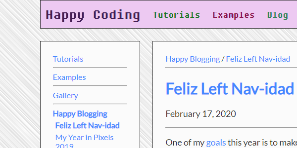
The first thing I tried was getting rid of the left nav and increasing the width of each section:
That felt like a move in the right direction, but I definitely wasn’t done yet.
Iterating
Next I tried adding backgrounds to each individual section and spent way too much time playing with CSS gradients. I also added a couple new sections to the homepage, and I went back and forth between making each section fill the height, which ended up being a single line of CSS:
height: 1vh;
I played with a fancy scroll library called Locomotive Scroll, but that didn’t work on my phone, so I switched over to AOS. That worked, and it was surprisingly easy to use, but I’m still not sure if I love the effect.
I also used Discorse’s embedding feature to show recent forum posts on the homepage, and I decided to hard-code a few Etsy links instead of randomly generating them.
After all of that, the homepage looked like this:
I had pretty mixed feelings about this. It was maybe getting closer to feeling like a “real” webpage. But it didn’t feel quite right, and more importantly it didn’t feel like me. That’s a hard feeling to put into words, but it was pretty obvious to me that I was trying to copy patterns instead of doing my own thing.
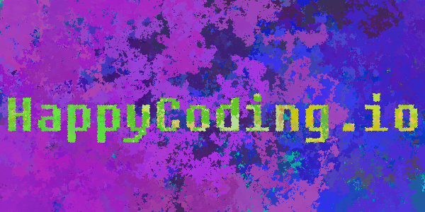
Background Info
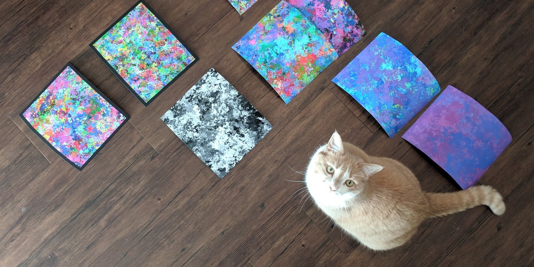
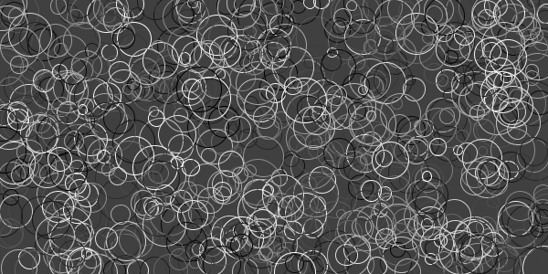
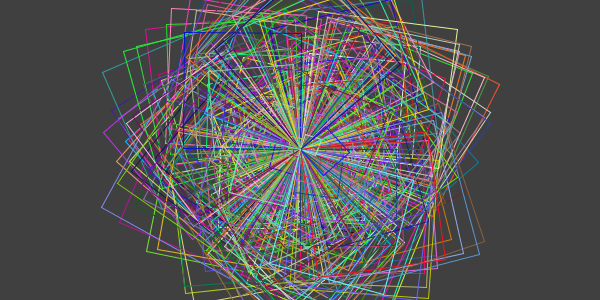
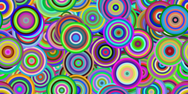
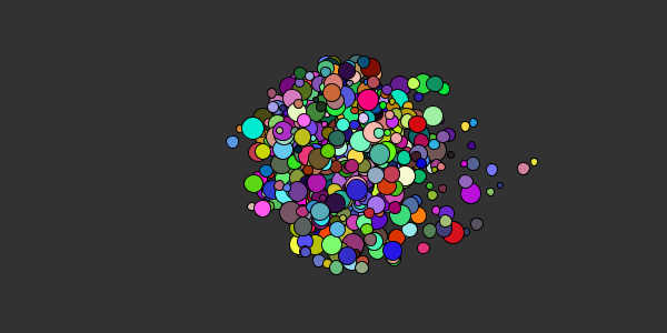
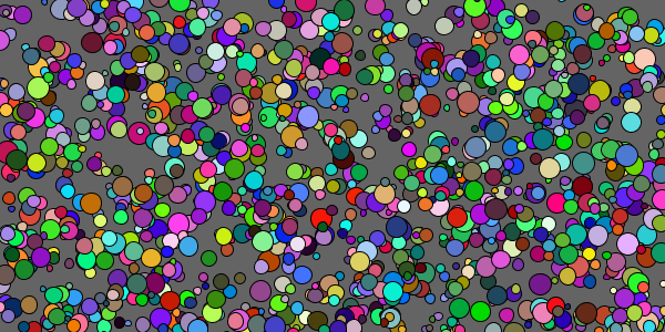
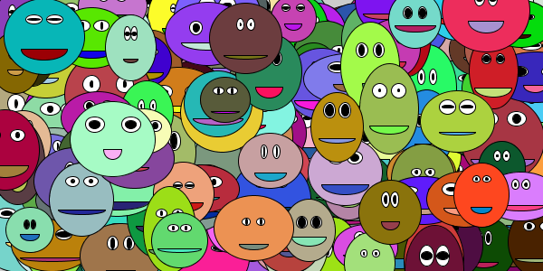
Since the beginning, Happy Coding has used subtle background images (see the first screenshot above for an example). I generated the images myself using Processing, but I intentionally made them subtle so they weren’t too distracting.
Next, I tried switching all of this up, and I added a colorful background to the page itself, rather than on each individual section:
You can’t see this in the screenshot, but the background is actually animated. It’s a full-screen p5.js sketch positioned behind everything else. I really liked the effect, and I thought about showing a different random background animation whenever the page was loaded.
I debated with myself whether that would be too distracting, especially on long tutorial pages with lots of text, and whether it would work on every device and browser. I’ve tried pretty hard to keep Happy Coding’s footprint small, and having a couple million pixels animating in the background of every page felt like a violation of that principle.
Finding a Compromise
In the end, I decided on a compromise: I created a few colorful animations, took screenshots, and used those screenshots as background images. This way the background is still interesting, but not distracting or CPU-intensive. I’m also going to invite other folks to contribute their own backgrounds- this was already a “feature” of Happy Coding, but it’ll be fun to revisit.
To help the page sections stand out from the background, I also increased their borders. I laughed a little at myself when I settled on a thickness of 5px. This is my tiny rebellion, because at my day job margins are always multiples of 4px, so choosing 5px felt like a petty way to prove I was doing this for myself. 🤘
You can see a lot of these changes on every page on Happy Coding- including this blog post! But here’s what the homepage looked like in the end:
I’m pretty happy with the end result. It’s not really what I originally pictured, but it feels more authentically mine than if I forced myself to conform to a pattern just for the sake of conformity. I know I’m overthinking all of this, but it’s mine to overthink.
Ship It ⛵
I could keep tinkering with single-pixel differences, comparing screenshots and asking myself whether I’m making things better or worse with each change. But I’m at the “good enough, ship it” stage, so I’m shipping it!
I’ll probably spend some time playing with more backgrounds. I’d also love for other folks to contribute their own backgrounds, so I’m going to rewrite the guide for that as well. (Editor’s note: See How to Contribute a Background!)
I’d love to hear any feedback y’all have. Do the new backgrounds look okay, or are they too distracting? Do you notice any weirdness on any particular OS or browser? What would make Happy Coding feel more like a “real” website?