CSS Layout
CSS Layout
- Divs
- Brief History
- Flexbox
- Flex Properties
- Learning More
- Grid
- The Holy Grail Layout
- Nesting Layouts
- Responsive Design
- Learn More
Now you know how to use HTML to create webpage content, and you know how to use CSS to style that content.
This tutorial talks about different ways to position elements in your page.
Divs
By now, you’ve probably seen HTML tags that specify different kinds of content, like <h1> and <p>. There’s another HTML tag that’s especially handy for creating layouts: the <div> tag! If you’re new to HTML and CSS, you might not have used it much, so here’s a quick intro.
The <div> tag represents a division of content. It lets you group other tags together into sections, and you can style those sections using CSS. Here’s an example:
See the Pen by Happy Coding (@KevinWorkman) on CodePen.
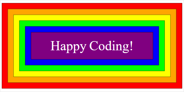
This code creates a yellow div that contains some content, including two other divs. The red div contains some text, and the blue div contains other HTML tags.
There are other HTML tags related to layout, like <main> and <article>, but <div> is the one you’ll see most often.
By default, divs are shown on their own line, so multiple divs will show up on top of each other. The rest of this tutorial talks about how to change that default behavior.
Brief History
CSS has a few different ways to position elements, and I’ve personally found it really confusing to have so many options to choose from. Should I use floats? Or inline blocks? Or both? Or neither?? I found that understanding the history of CSS has helped me understand CSS itself much better. So let’s run through a brief history of layouts in CSS.
HTML was released around 1993. In the early days of web development, there was no such thing as CSS! Styling was done with HTML tags like <center> and with attributes like color (as in <font color="red">). Layout was done using HTML <table> elements, which let you place content into a grid.
Tables
For example, to create a webpage with a left nav and a content section, here’s how you might have done it before CSS:
See the Pen by Happy Coding (@KevinWorkman) on CodePen.
Using tables for layout might work, but it’s generally considered a bad idea. It’s harder to maintain, and it doesn’t work well with screen readers. I’m including this example here to provide historic context, but nowadays you shouldn’t use tables for layout.
CSS 1
The first version of CSS was released in 1996, and it mostly dealt with styling text content: stuff like fonts and colors, not layout. Positioning elements was still done using HTML tables.
HTML 3.2 was released in 1997, and it included the <div> tag.
CSS 2
Then CSS 2 was released in 1998, and it included rules for positioning content. For example, you could set the float property of an element to left or right so that it displayed to the left or right of other elements, and you could set the display property of an element to block or inline-block to change how other elements were laid out around it. You could also set the position of an element manually if you really wanted to.
Floats
Here’s how you’d create the left nav using floats:
See the Pen by Happy Coding (@KevinWorkman) on CodePen.
Floats are still commonly used in CSS layouts, although they come with a few downsides. The browser treats floated elements as if they take up no space- that’s why the content div has a left margin. Try removing that style to see what happens. Then try adding a footer to the page to see why floats can be tricky to work with.
Blocks
And here’s how you might do it with inline blocks:
See the Pen by Happy Coding (@KevinWorkman) on CodePen.
Like floats, inline blocks are also still used in CSS layouts, but they also have their own downsides. For example, browsers will wrap an inline block onto the next line if the content gets too wide. Try adding some long text to the content div and then making your browser less wide to see what I mean!
Flexbox
After CSS 2, the history of CSS gets pretty complicated, mostly because CSS was split into a bunch of different modules with their own histories. But long story short, CSS 3 was built on top of CSS 2, and one of the features added to CSS 3 was flexbox in 2017.
Flexbox lets you define the relationships between parent elements and child elements. By itself that might not sound very useful, but it’s an extremely powerful tool when you’re trying to position a bunch of content in your page. For example, with flexbox you can tell the browser to display several elements in a row, and you can give every child element different rules about how to size themselves. And the browser does the rest of the work for you!
To use flexbox, set display: flex on a parent element (an element that contains other elements), and then set other flex properties on both the parent and child elements to customize your layout.
For example, here’s the above left nav example, this time using flexbox:
See the Pen by Happy Coding (@KevinWorkman) on CodePen.
Flex Properties
To use flexbox, set display: flex on a parent element (an element that contains other elements), and then set other flex properties on both the parent and child elements to customize your layout.
Here are a few common flex properties:
display: flex
This is the property that kicks it all off. Set this on a parent element (often a div) to tell it to use flex rules to lay out its children (the elements it contains).
.container {
  display: flex;
}
See the Pen by Happy Coding (@KevinWorkman) on CodePen.
flex-direction
By default, flex containers (elements with display: flex) lay out their children in a row. You can set the flex-direction property to column to change this.
.container {
  display: flex;
  flex-direction: column;
}
See the Pen by Happy Coding (@KevinWorkman) on CodePen.
flex-wrap
By default, flex containers lay out their children in a single row or column. If the container contains more elements than will fit into a single line, then those elements get smooshed.
To wrap child elements instead of smooshing them, set flex-wrap to wrap.
.container {
  display: flex;
  flex-wrap: wrap;
}
See the Pen by Happy Coding (@KevinWorkman) on CodePen.
The default value is nowrap.
For flex containers with wrapped children, you can also set the align-content property to specify the spacing of the wrapped content.
justify-content
By default, flex containers lay out their children starting at the far left (or top for containers with flex-direction:column) without any space between them.
To change how children are spaced, set the justify-content property.
.container {
  display: flex;
  justify-content: space-around;
}
There are a few values to choose from:
flex-startis the defaultcenterputs children in the center, with no space between themspace-betweenadds space between the children, but not before the first item or after the last itemspace-aroundadds space between the children, including before the first item and after the last itemspace-evenlyadds space between the children, and makes it so the first and last item have the same space as middle children
Try changing this code to see the difference:
See the Pen by Happy Coding (@KevinWorkman) on CodePen.
align-items
By default, flex containers align their children to the top (or to the left for containers with flex-direction:column) and set their height (or width) to fill the remaining space.
To change how children are aligned, set the align-items property.
.container {
  display: flex;
  align-items: center;
}
There are a few options to choose from:
stretchis the defaultflex-startaligns children to the top (or to the left for containers withflex-direction:column) but does not stretch them to fill the remaining spaceflex-endaligns children to the bottom (or right) but does not stretch them to fill the remaining spacecenteraligns children to the center
Try changing this code to see the difference:
See the Pen by Happy Coding (@KevinWorkman) on CodePen.
gap
By default, flex containers do not add any spacing between their children. You can change that with justify-content, align-items, and align-content. You can also manually set the gap property.
.container {
  display: flex;
  gap: 25px;
}
See the Pen by Happy Coding (@KevinWorkman) on CodePen.
flex-grow
By default, elements inside flex containers will not expand to fill extra space in the container.
You can tell an element to fill any extra space using the flex-grow property.
.container {
  display: flex;
}

.child {
  flex-grow: 1;
}
The flex-grow property takes a number, which represents how much that child will grow compared to its siblings.
That’s a little confusing, so here’s an example:
See the Pen by Happy Coding (@KevinWorkman) on CodePen.
In this example, the .red class has the default flex-grow value of 0, which means it does not grow at all. Then the .blue and .green classes have flex-grow values of 1 and 2 respectively, which means that .green will grow twice as much as .blue.
Try changing the code to see the effect of different values.
flex-shrink
By default, if a flex container is not wide enough (or tall enough for containers with flex-direction:column) to fit all of its child elements, then those child elements all shrink equally.
To have different child elements shrink at different rates, set their flex-shrink property.
.container {
  display: flex;
}

.child {
  flex-shrink: 2;
}
This is similar to flex-grow in that the value is a number that represents how much a child will shrink compared to its siblings. The default is 1, but you can set it to 0 to never shrink, or to a higher number to shrink it more.
See the Pen by Happy Coding (@KevinWorkman) on CodePen.
flex-basis
By default, elements inside flex containers set their own sizes, either through the width and height properties or from their content.
Instead of relying on an element’s own size, you can set its initial size using the flex-basis property.
.container {
  display: flex;
}

.child {
  flex-basis: 200px;
}
See the Pen by Happy Coding (@KevinWorkman) on CodePen.
flex
The power of flex-grow, flex-shrink, and flex-basis might not be obvious. Why should you use those instead of setting the width and height properties?
There are a couple reasons:
- You won’t always know the size of the user’s browser window. Will they be on a laptop? On a widescreen monitor? On a phone? Making sure your content fits on every screen is really hard!
- You won’t always know the size of your own content. That might sound surprising, but do you want to adjust the widths of every element on your page whenever your content changes? This is especially true if you’re fetching content from other places (like an API, or a backend) instead of writing it yourself.
With flexbox, you can set the flex-grow, flex-shrink, and flex-basis properties to tell your content how to lay itself out. What should grow when it’s viewed on a widescreen monitor? What should shrink when it’s viewed on a phone? What size should everything be by default, before the growing and shrinking?
In fact, these three properties are so useful that you can combine them into a single property named flex.
So if you have this CSS:
.child {
  flex-grow: 1;
  flex-shrink: 2;
  flex-basis: 300px;
}
You can shorten it to this:
.child {
  flex: 1 2 300px;
}
To understand why this is useful, try changing the width of the parent div in this example:
See the Pen by Happy Coding (@KevinWorkman) on CodePen.
(It might help to view the fullscreen version.)
The children all start out at certain sizes, thanks to their flex-basis properties.
When you make the parent div bigger, the red child does not grow at all, because its flex-grow is 0. The green child grows faster than the blue child, because their flex-grow properties are 2 and 1.
When you make the parent div smaller, the red child shrinks faster than the blue child, because their flex-shrink properties are 2 and 1. The green child doesn’t shrink at all, because its flex-shrink is 0.
This means you can set these properties and then not worry about the exact size of your content, or the exact size of the user’s browser window.
Learning More
We covered the fundamentals of flexbox above, but there are other properties and values you can use. To learn more about them, check out A Complete Guide to Flexbox on CSS Tricks.
And of course, don’t be afraid to search the internet when you’re not sure about something. There are plenty of great resources out there!
Grid
Flexbox is most useful when you have a single row (or column) of content. Flexbox containers can wrap their content into multiple rows (or columns) using the flex-wrap property, but you don’t have much control over the alignment of those items.
That’s probably okay for many layouts, but if you want more control over how your elements are positioned, you can use the grid layout.
To put grid layout in historical context, technically it hasn’t officially been released yet, but as of 2022 almost every browser already supports it anyway. CSS is weird!
Here’s the above left nav example using Grid:
See the Pen by Happy Coding (@KevinWorkman) on CodePen.
Grid Properties
To use grid, set display: grid on a parent element, and then set other grid properties on both the parent and child elements to customize your layout.
display: grid
This is the property that kicks it all off. Set this on a parent element (often a div) to tell it to use grid rules to lay out its children (the elements it contains).
.container {
  display: grid;
}
See the Pen by Happy Coding (@KevinWorkman) on CodePen.
By itself, that’s not very interesting, because by default a grid is a single column of elements.
grid-template-columns
By default, a grid is a single column of elements.
To split your grid into multiple columns, use the grid-template-columns property.
.container {
  display: grid;
  grid-template-columns: 100px 1fr 2fr;
}
See the Pen by Happy Coding (@KevinWorkman) on CodePen.
The grid-template-columns property takes a space-separate list of sizes, and will lay out the content in that many columns, with those sizes.
The sizes can be a few different kinds of values:
- Specific lengths like
100pxor10emthat give the column a predefined width. - Percentage lengths like
50%that tell the column to take up that percent of the parent’s width. - Fraction lengths like
1fror2frthat tell the column to take up a width relative to the other columns in the grid. You can think of this as similar to howflex-growworked above: a column with2frwill take up roughly twice as much width as a column with1fr. autotells the column to size itself based on the elements in it, as well as the size of the container and of the other columns in the container.
See grid-template-columns on MDN for other kinds of values.
The above example of grid-template-columns: 100px 1fr 2fr creates three columns: one that’s 100px wide, and then a middle column that will take up about half the width of the third column.
grid-template-rows
Similar to grid-template-columns, grid-template-rows lets you specify the heights of each row.
By defining both grid-template-columns and grid-template-rows, you can create a grid of content!
.container {
  display: grid;
  grid-template-columns: 1fr 2fr;
  grid-template-rows : 100px 50px 100px;
}
See the Pen by Happy Coding (@KevinWorkman) on CodePen.
Try changing this code so it has 3 columns and 2 rows instead!
Placing Items in the Grid
By default, items take up one cell in their parent grid, and they appear in the order that you list them in your HTML.
You can make an element take up more than one cell using these properties:
grid-column-startandgrid-column-endtell a cell which columns to occupygrid-row-startandgrid-row-endtell a cell which rows to occupy
.container {
  display: grid;
  grid-template-columns: 1fr 2fr;
  grid-template-rows : 100px 50px 100px;
}

.child {
  grid-column-start: 1;
  grid-column-end: 3;
}

.other-child {
  grid-row-start: 2;
  grid-row-end: 4;
}
Here’s an example:
See the Pen by Happy Coding (@KevinWorkman) on CodePen.
The red div starts at column 1 and goes until column 3, so it takes up both columns. The green div starts at row 2 and goes until row 4, so it takes up rows 2 and 3.
Also notice that the green div appears before the blue div, even though it comes after in the HTML. This can be handy for making sure your main content is first in your HTML, which can help with things like screen readers and SEO.
You can also use the grid-column and grid-row shorthand:
.container {
  display: grid;
  grid-template-columns: 1fr 2fr;
  grid-template-rows : 100px 50px 100px;
}

.child {
  grid-column: 1 / 3;
}

.other-child {
  grid-row: 2 / 4;
}
Named Cells
The above examples use numbers to specify which cells an element occupies.
You can instead name your cells, and then specify element locations using those names.
First, add names to your container columns and rows using [] square brackets:
.container {
  display: grid;
  grid-template-columns: [left] 1fr 2fr [right];
  grid-template-rows : 100px [middle] 50px 100px [bottom];
}
You’re actually naming the lines between cells. This is the same CSS as above, except now a few of the lines between cells have names.
Then, use those names to place your child elements:
.red {
  background-color: red;
  grid-column-start: left;
  grid-column-end: right;
 /* Could be shortened to grid-column: left / right; */
}
.green {
  background-color: lime;
  grid-row-start: middle;
  grid-row-end: bottom;
  /* Could be shortened to grid-row: middle / bottom; */
}
Here’s the full code:
See the Pen by Happy Coding (@KevinWorkman) on CodePen.
Other Grid Properties
Grid has many other properties, and shortcuts for writing fewer lines of code. Rather than trying to list them all here, I encourage you to read through A Complete Guide to Grid on CSS Tricks, CSS Grid Layout on W3Schools, and CSS Grid Layout on MDN.
More importantly, I encourage you to try stuff out! If you want to experiment with grid layout (or flexbox, or anything really) then the best thing you can do is create a scratch file or a CodePen project and try it out! Get something working, and then see if there are other ways to write your code.
The Holy Grail Layout
One particular layout is so popular that they gave it a name: the holy grail.
The holy grail layout is a website that has a header, a left sidebar, a main content area, a right sidebar, and a footer. You can probably name a few websites that use this layout.
Here are a couple examples of the holy grail layout:
Using flexbox:
See the Pen by Happy Coding (@KevinWorkman) on CodePen.
Using grid:
See the Pen by Happy Coding (@KevinWorkman) on CodePen.
If you want a challenge, and if you want to understand what makes flexbox and grid so popular, try implementing the holy grail layout only using floats or blocks!
Nesting Layouts
I’ve listed a few approaches to creating layouts above, but you don’t have to choose just one! In fact, most websites use a combination of all of the above.
For example, you might use grid to create your outermost layout that positions a header, a sidebar, the main content, and a footer. Your header might use flexbox to create a row of navigation links. The main content might contain images that are floated to the left or right.
Try thinking about each section of your page as its own layout, and then use whichever tools make the most sense for that specific section.
Responsive Design
Making sure your website works on everybody’s monitor has been a big part of layout and design, ever since the early days of HTML.
But this became even more challenging in the late 2000s and early 2010s, as cell phones became more popular for browsing the web. How do you make sure your website looks good on a tiny cell phone, a widescreen monitor, and everything in between?
One popular way to think about it is responsive design. Responsive design is the idea that your website should respond to changes in the screen size. Maybe your page only shows the main content on narrow devices, but adds a left sidebar on medium-sized devices, and splits the content into multiple columns on widescreen devices.
Here’s an example:
Mobile-First Design and Progressive Enhancement
Responsive design means that you show a different layout on different screen sizes. You might think of this as hiding parts of your website on smaller screens, but another way to think about it is that smaller screens contain all of the essential content, and larger screens show “extra” content that’s not strictly required.
Starting your design by thinking in terms of small screens is called mobile-first design, and thinking in terms of adding additional features to wider screens is called progressive enhancement.
These are a little buzzword-y, but I do find them helpful in thinking about how to design the layout of a webpage.
You can read more about responsive design on at Responsive design - MDN and Responsive web design - Wikipedia.
Media Queries
To show a different layout depending on the screen size, you can use a CSS feature called media queries.
A media query uses the @media keyword, then a media type (you probably want screen, but you can also customize what your website looks printed out with print), then a media feature that lets you set up rules for different kinds of displays. Then inside { } curly braces, you put any rules you want to apply to your query. Here’s an example:
See the Pen by Happy Coding (@KevinWorkman) on CodePen.
(It might help to view the fullscreen version.)
By default, the .content class has a thin solid black border and a cyan background. But on screens that are wider than 700 pixels, the .content class will have a lime background. Because we aren’t changing the border on wide screens, it maintains the thin solid black default.
Here’s a more complex example that displays content in a single column by default, and in the holy grail layout on devices wider than 600 pixels:
See the Pen by Happy Coding (@KevinWorkman) on CodePen.
(It might help to view the fullscreen version.)
This example also completely hides the left sidebar on mobile.
See the Beginner’s guide to media queries on MDN and CSS @media Rule on W3Schools for more info.
Developer Tools
When you’re creating and debugging layouts in CSS, your best friend is your browser’s developer tools! They can help you understand why things are aligning a certain way, or where that extra few pixels of space is coming from.
You can even use device mode to see what your webpage looks like on different devices. This is much easier than constantly resizing your window!
Learn More
Here are a few resources to help you learn more about layouts in CSS:
- Old CSS, new CSS is a great description of the history of CSS, which helps put everything into context. (Warning: contains some swears.)
- A brief history of CSS is a more official version of events.
- Thumbnail grid examples is a study of how to implement a thumbnail grid using many of the above layout approaches.
- A Complete Guide to Flexbox on CSS Tricks has a great infographic of different flex properties.
- Josh W. Comeau’s Interactive Guide to Flexbox is another great interactive tutorial on flexbox.
- A Complete Guide to Grid on CSS Tricks, CSS Grid Layout on W3Schools, and CSS Grid Layout on MDN are good places to learn more about grid layout.
- Responsive design - MDN and Responsive web design - Wikipedia contain descriptions of responsive design.
- Beginner’s guide to media queries on MDN and CSS @media Rule on W3Schools contain more info about media queries.
- CSS Zen Garden shows how the same HTML content can be laid out very differently by changing the CSS.
