Accessibility
Accessibility
- Disclaimers
- IRL Accessibility
- Why is accessibility important?
- Empathy
- Disabilities
- Accessible Devices
- W3C, WAI, WCAG, ARIA
- Improving Accessibility
- Testing Accessibility
- Summary
- Learn More
Now you know how to use HTML to build a website, and how to use CSS to style that website. You might even know how to use JavaScript to make your website interactive, although that’s not a strict prerequisite for this guide.
This guide introduces a concept called accessibility, which is the idea that your website should be usable by everyone, including folks with vision, motor, and neurological disabilities. This guide also introduces a few techniques you can use to make sure your website is as accessible as possible.
Disclaimers
Before we dive into accessibility, I want to say that I’m still learning about this myself. I’m especially self-conscious about talking about disabilities, because I don’t want to accidentally say something hurtful or ignorant. I’ve tried my best to research the right way to talk about things, but I recognize that I might get something wrong. When that’s the case, please help me learn by letting me know.
I’ll also mention that I’ve tried my best to make Happy Coding as accessible as possible, but I definitely haven’t fixed every bug. If you notice something, feel free to let me know.
IRL Accessibility
Before we talk about web accessibility, take a second to think about accessibility in the real world.
You’ve probably seen accessible devices in real life before. Here are a few examples:
- Wheelchair ramps that help wheelchair users enter a building.
- Brail signs that help people who are blind understand what’s around them.
- Pedestrian crosswalks that help people cross the road.
- Side note: these can be a great example of accessibility! At a single crosswalk you might see a curb cut instead of a step, patterned markings on the ground, and auditory signals in addition to visible lights and signs.
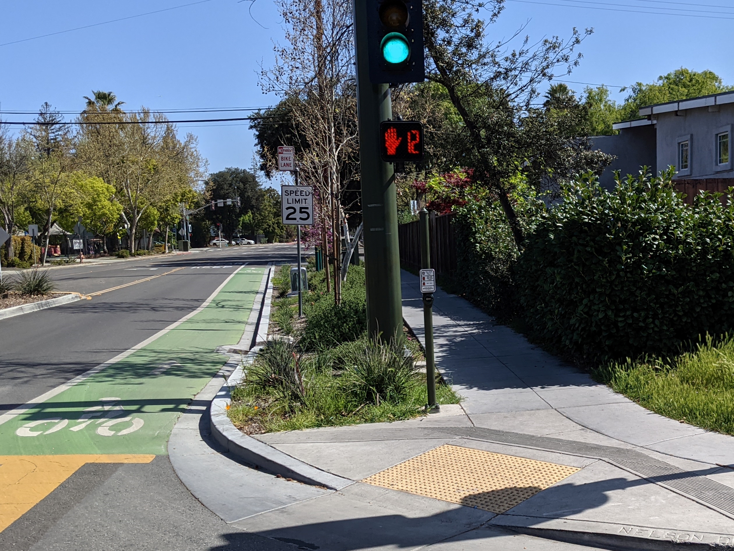
One thing worth noting is that many accessible devices improve the experience of everyone. For example, wheelchair ramps also help people pushing a stroller or a cart, or people who have difficulty climbing stairs.
Why is accessibility important?
Accessibility is important for a few reasons:
1. It’s the law.
Many laws exist with the goal of preventing discrimination against people with disabilities. Historically, these laws were about people’s behaviors and the physical world: businesses generally need to provide an entrance that’s accessible by folks using a wheelchair, for example.
But more recently, these laws have grown to include not just human behavior in the physical world, but also technology like websites and computer applications. In other words, there are laws that require your website to be usable by everyone. This includes folks with disabilities that prevent them from seeing the screen or using a mouse and keyboard. Companies have been sued for having websites and apps that aren’t accessible!
2. It’s good for your webpage.
Accessibility is not just the law, it also benefits your page directly. Exactly like installing a wheelchair ramp in the real world makes it easier for everyone to enter a building, making your website more accessible improves the experience of people with disabilities, but it also improves the experience of everyone else as well.
For example, you might increase the size of buttons on your page to make them easier for people with vision disabilities to click on. Congratulations, you also made them easier for everyone else to click on as well! How often have you been annoyed trying to click a tiny button when you’re browsing the web on your phone? Fixing accessibility issues improves your site for all of your users.
Search engines generally prioritize accessible sites, which is another way that accessibility benefits your page.
3. It’s good for you.
Because of this (and the threat of being sued), accessibility is a popular topic in the tech industry right now. Being able to talk about accessibility in an interview improves your chances of getting a job, and understanding accessibility can help you after you get a job. So accessibility is also good for you!
3. It’s good for the people who use your site.
I’ve listed the above reasons because they’re all true, but for me personally, that’s not why I care about accessibility. I care about accessibility because I care about people.
That might sound a little melodramatic, but I think about it this way: who am I building my webpage for? Is it only for people who look like me? Only for people with the exact same abilities as me? Or am I building it for everyone?
For example, I know that every time I upload an image without alt text, I’m making it harder for people who are blind to use my site. Why wouldn’t I want to fix that?
The answer to that question is generally either “I don’t know how to fix it” in which case this guide is meant for you! Or it’s “I don’t have time to fix it” in which case I’d encourage you to think about the people at the other end of that equation.
Empathy
I don’t want to belabor the point too much, but I honestly believe that the most important takeaway I can offer is a sense of empathy for the people using your website. Seeing your users as people is more important than understanding semantic HTML and ARIA attributes, because that sense of empathy is harder to look up. W3Schools doesn’t have a tutorial on caring about other humans.
With this in mind, I strongly encourage you to learn more about the experiences of people with disabilities.
W3.org’s User Stories is a good place to start. I also recommend checking out Tommy Edison’s videos.
Empathy Challenge
To really put yourself in the shoes of somebody with a disability, try this challenge:
- Take out your phone
- Enable the screen reader (see below for how)
- Familiarize yourself with your screen reader’s functionality
- Now use your screen reader to use an app that you use often. How does Twitter or Instagram work with a screen reader? Can you use the app with your eyes closed?
- Now use your screen reader to use your website.
How did that work? How did you feel? What was easy or difficult about the experience?
Disabilities
To understand accessibility, it can help to think about the different types of disabilities people using your page might have. Here are a few examples:
- Color blindness. What does your site look like for folks with different types of color blindness? Are you using good contrast?
- Limited sight. What does your site look like for folks with vision issues? What happens when you zoom in or increase the font size?
- Blindness. How does your site work with a screen reader?
- Deafness. Do any videos on your webpage have captions?
- Limited mobility. How does your site work with keyboard navigation, or a switch device?
- Neurological disorders like dyslexia and ADHD. How does your site work for folks who think differently than you do?
- Injuries. If I injure one of my hands, can I still use your page?
I hope these examples get you thinking about the different kinds of contexts people bring to your webpage. And remember that improving accessibility makes your site easier to use for everyone! For example, increasing the size of the buttons on your page will make your site more usable for folks with limited mobility, while also making it more usable for folks viewing your site on a small mobile device, or for folks wearing gloves who can’t click on tiny buttons. Everybody wins!
See Diverse Abilities and Barriers for more examples.
Accessible Devices
Now that you have a rough idea about some of the disabilities folks might have, let’s talk about the ways that might impact how they use your site.
Screen Readers
Screen readers do pretty much exactly what it sounds like they do: they read the screen. This is especially handy for folks with sight-related disabilities who might not be able to see what’s on the screen themselves.
Most computers and phones come with a screen reader. Try enabling yours now!
- On Android, enable TalkBack and then go through the TalkBack tutorial
- On iPhone or Mac, enable VoiceOver for iPhone or VoiceOver for Mac
- On Windows, enable Narrator and then go through the Narrator tutorial
You can also install the Screen Reader Chrome extension. It’s a little incovenient because you can’t turn this extension off without uninstalling it. But this is what I use most often for testing screen reader behaviors.
Switch Devices
Switch devices let users interact with a computer using a button or switch. This is especially handy for folks with limited mobility, who can’t use a keyboard or mouse.
Keyboards, Mice, and Screens
You might not think of these as accessible devices, but I might argue that they’re the most common accessible devices in the world! People with disabilities use these devices all the time.
W3C, WAI, WCAG, ARIA
The world of accessibility has a lot of acronyms- starting with accessibility itself, which is often abbreviated as a11y! (There are 11 letters between the a and y.)
This can be pretty confusing, so here are a few you’ll see pretty often.
- W3C is the World Wide Web Consortium, which is the organization that decides how the web should work. They decide on new HTML tags and CSS rules, among many other things! Read more about W3C on Wikipedia.
- WAI is the Web Accessibility Initiative, which is the part of W3C that works on accessibility. They publish recommendations for how to improve your website’s accessibility, as well as proposals for changing the web itself. Read more about WAI on Wikipedia.
- WCAG is the Web Content Accessibility Guidelines, which are the recommendations put out by the WAI. Read more about WCAG on Wikipedia.
- ARIA is Accessible Rich Internet Applications, which is a set of HTML attributes that help improve your content’s accessibility.
- Note: You only need ARIA attributes if you have content that’s not already accessible. See the semantic HTML section for more info.
Improving Accessibility
If you’re new to accessibility, you might be expecting a list of rules you can follow to make sure your site is accessible. But it doesn’t really work that way! Because there are so many different ways your website might work, a lot of accessibility is subjective: how hard is your site to use? How painful is it for the people using it?
In other words, accessibility isn’t an either-or, yes-or-no thing. Instead of asking yourself “is my site accessible?”, I’d encourage you to think about it as a spectrum: How accessible is my site? What about it is hard to use, and how can I improve that?
This can be a little frustrating, especially if you’re used to the very precise nature of writing code. So with that said, here is a list of things you can do to improve your site’s accessibility.
Semantic HTML
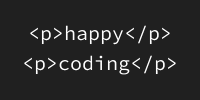
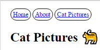
HTML tags tell a browser what type of content to display: an <h1> tag is a heading, a <button> is a button, etc. This is called semantic HTML, because the HTML itself conveys meaning. Accessible devices also rely on semantic HTML tags to know how to behave: a screen reader might let a user navigate by headings, or a switch device might let a user click on buttons on the screen by pressing a physical button.
It’s also possible to create elements using <div> tags. Let’s say you wanted to create a custom button: you could start with a <div> tag, and then add some CSS to make it look like a button, and some JavaScript to do something when the user clicks it.
But <div> tags don’t supply any meaning, other than an arbitrary division of content. If you use CSS to indicate that a <div> should be treated like a button, it might be obvious to sighted users that they can click on it. But it won’t be obvious to screen reader users, because the screen reader won’t announce the content as being clickable.
Here’s an example with non-semantic HTML:
See the Pen by Happy Coding (@KevinWorkman) on CodePen.
View the non-semantic HTML example fullscreen.
Try opening that page and using a screen reader to navigate and click the button. It doesn’t really work, because the screen reader doesn’t recognize that the divs represent headings and buttons!
Here’s the same example with semantic HTML:
See the Pen by Happy Coding (@KevinWorkman) on CodePen.
View the semantic HTML example fullscreen.
Try this version of the page with a screen reader. Now navigating by headings works, and the button is announced as a button!
It’s fine to use tags like <div> when you want to group some content without adding any meaning to that grouping. But whenever you want to communicate meaning to your user, use semantic HTML tags rather than arbitrary tags like <div> or <span>.
If you can’t use semantic HTML, see the aria-role section below.
Alt Text
Images are another pain point for screen reader users. A sighted user can look at the image to know what it is, but blind users have to guess.
Here’s an example that uses images without alt text:
See the Pen by Happy Coding (@KevinWorkman) on CodePen.
View the images without alt text example fullscreen.
Try opening that page and using a screen reader to read the contents. Because the images don’t have alt text, the screen reader reads out the file name, which isn’t very helpful!
Instead, you can improve an image’s accessibility by providing an alt attribute, like this:
<img src="cat.png" alt="A cat frolicking through some red flowers." />
Here’s the same example with alt text added:
See the Pen by Happy Coding (@KevinWorkman) on CodePen.
View the images with alt text example fullscreen.
Try this version of the page witha screen reader. Now the experience is a lot more meaningful!
If you can’t provide an alt attribute, see the aria-label section below.
Empathy challenge: Try navigating a photo or video-centric app like Twitter, Instagram, or TikTok with a screen reader. What percentage of posts contain alt text?
ARIA Attributes
In situations where you can’t use semantic HTML or provide alt text, you can add special attributes that provide extra information to accessible devices. You can read more about ARIA attributes on MDN, but the two attributes you’ll see most often are:
aria-label
The aria-label attribute is meant for situations where you have an interactive element like a button, whose content is an image, where that image does not have any alt text.
Here’s an example without ARIA labels:
See the Pen by Happy Coding (@KevinWorkman) on CodePen.
View the buttons without ARIA labels example fullscreen.
Try opening that page and using a screen reader to click one of the buttons. Because the images don’t have alt text, the screen reader reads out the file name, which isn’t very helpful!
Here’s the same example, this time with ARIA labels:
See the Pen by Happy Coding (@KevinWorkman) on CodePen.
View the images with alt text example fullscreen.
Try this version of the page with a screen reader. Now each button is announced with the right label!
You don’t always need to specify the aria-label attribute. If a button contains text, or contains an image with alt text, then you don’t need to specify the aria-label attribute. ARIA attributes are for situations where you can’t otherwise provide the information.
role
The role attribute is meant for situations where you can’t use semantic HTML. There are many available ARIA roles, like heading, dialog, and button. Use these when you have a non-semantic element that’s acting as a semantic element, and you can’t use the semantic element for some reason.
Here’s an example with non-semantic HTML without any role attributes:
See the Pen by Happy Coding (@KevinWorkman) on CodePen.
View the non-semantic HTML example fullscreen.
Try opening that page and using a screen reader to navigate and click the button. It doesn’t really work, because the screen reader doesn’t recognize that the divs represent headings and buttons!
To improve this, you can add role attributes to each of the non-semantic elements:
See the Pen by Happy Coding (@KevinWorkman) on CodePen.
View the ARIA role example fullscreen.
Try this version of the page with a screen reader. Now the headings are treated as headings, and the button is announced as a button.
Note: You should only need to use a role attribute if for some reason you can’t use semantic HTML.
This is bad, because it uses a non-semantic tag to represent a heading, and doesn’t specify the heading role:
<div>This is a heading!</div>
This is better, because it provides the role attribute so accessible devices will recognize it as a heading:
<div role="heading">This is a heading!</div>
This is best, because it uses a semantic tag and doesn’t need a role attribute:
<h1>This is a heading!</h1>
Focus Behavior
Many accessible devices rely on the focus to interact with a webpage. To see what I mean, try pressing the tab key on your keyboard right now. That should move the focus to the next focusable element- probably a link or a button. Press tab again to move the focus to the next focusable element, or press shift+tab to move the focus to the previous focusable element. Press the enter key to interact with a focused element.
This is how people interact with webpages and other applications without a mouse. Many accessible devices rely on the focus behavior as well, which makes it very important to get right.
If your focus behavior is wrong, you might see situations where the focus moves to off-screen elements, or where you can’t focus an on-screen element, or where elements are focused in the wrong order. You can often fix focus issues either using semantic HTML or by adding a tabindex attribute depending on how you want an element to behave:
tabindex="-1"means an element can’t be focused by the user. This is often used on hidden elements that will become visible later.tabindex="0"means an element can be focused by the user. This is often used for non-semantic elements like<div>tags that wouldn’t otherwise be focusable.tabindex="1"(or any other positive number) means the element can be focused after any elements withtabindex="0". This is generally discouraged, and you should place your elements in your HTML in the order they should be focused.
The focus should also be visible, so you can write CSS that changes the focus styling, but you shouldn’t hide it.
Sizing and Spacing
Links and buttons that are too small can be hard to click. You’ve probably experienced this yourself if you’ve ever tried to browse the web on a small mobile devices. This is even more difficult for people with mobility issues.
See the Pen by Happy Coding (@KevinWorkman) on CodePen.
View the tiny buttons example fullscreen.
With that in mind, WCAG recommends that clickable elements are sized at least 44x44 pixels. This is mostly for elements like navigation links and interactive buttons- elements like inline links can be the same size as the surrounding text.
Similarly, elements that are too close together can be hard to click. WCAG doesn’t have an official spacing recommendation, but generally, 12 pixel spacing is a reasonable minimum.
See the Pen by Happy Coding (@KevinWorkman) on CodePen.
View the big buttons example fullscreen.
Contrast
If your background color and your text color don’t have enough contrast, your text can be hard to read. Here are some examples:
This is especially difficult for people with vision-related disabilities. That doesn’t mean you can’t change the colors in your webpage, but you have to make sure the colors you choose have enough contrast to be readable. Here are some examples:
If you don’t know whether your colors have enough contrast, you can plug them into WebAIM’s contrast checker to make sure.
Testing Accessibility
How do you know if your site is accessible? Like I mentioned above, parts of accessibility are subjective: How usable is your site? So I wouldn’t think about it in terms of a binary, yes-or-no question: is my site accessible? Instead, I would think about it as a more open-ended set of questions: How accessible is your site? What pain points do different users have? This is why I talked so much about empathy at the beginning. Putting yourself in other shoes goes a long way towards answering these questions.
But with that said, here are a few things you can do to test your site’s accessibility.
Manual Testing
Start by testing your site yourself. How usable does your site feel?
Look for things like focus behavior, sizing and spacing, and contrast.
Try using your site with a screen reader. Can you do everything you can with a keyboard and mouse? How painful is it?
It can also be really helpful to get other people to use your site. What’s obvious to them? What’s not obvious to them? What’s easy or difficult? What’s confusing?
Developer Tools
Your browser comes with a powerful set of developer tools that help with debugging and getting more information about your webpage- or any webpage!
These developer tools include accessibility checkers that scan a webpage and let you know about certain accessibility issues. These won’t catch everything, but they’re a good partner to manual testing.
On Chrome, you can use Lighthouse. On Firefox, you can use Accessibility Inspector.
Try running your developer tool’s accessibility checker on this website right now!
Accessibility Scanner
Android offers an Accessibility Scanner app that can scan apps and websites to generate accessibility reports. Try installing it and scanning the apps you use, this website, and your own website!
Note: I’m not as familiar with iPhone, so let me know if there’s an equivalent app on iPhone!
Again, these automated checkers are not an alternative to manual testing, but they can help steer your way.
Accessibility Checklist
Like I’ve said a couple times, accessibility is not an either-or, yes-or-no box that you can check. It’s more subjective: How does your site feel? How inconvenient is it for users of accessible devices? What pain points do your various users face?
So there isn’t really a set of specific, technical rules that I can give you to make sure your site is accessible. The best thing I can suggest is to approach your design with empathy. How do your decisions affect the people using your site?
But with all of that said, here is a very rough list of steps I follow when I’m trying to improve a site’s accessibility:
- Check out the code.
- Are you using semantic HTML? If not, are you providing ARIA attributes?
- Do all of your images have alt text or ARIA labels?
- Manually test your site with a mouse and keyboard.
- How usable is your site with a mouse and keyboard? What pain points can you fix? If your site isn’t usable with a mouse and keyboard, it won’t be usable with accessible devices!
- Are interactive elements and buttons at least 44x44 pixels, and spaced 12 pixels apart?
- Do the background and foreground colors have enough contrast?
- Is the focus behavior reasonable? You should be able to focus on every interactive element, in a reasonable order, without focusing on off-screen elements.
- Can you use your site using only a keyboard, without a mouse?
- Manually test your site with a screen reader.
- Can you do everything you can do with a keyboard and mouse?
- How does it feel to use a screen reader? What parts of your site are annoying or broken with a screen reader?
- Use your developer tools to test the site.
- What issues are detected? Fix them, and use them as hints for what to manually test.
- Try other automated accessibility checkers, like Android’s Accessibility Scanner.
- Understand that there are people on the other side of your webpage. Put yourself in their shoes, and try to understand how they use your site.
Summary
Accessibility might feel intimidating, especially if you haven’t though much about it before. But remember that the most important concept in accessibility is not knowing which HTML tags to use or what styling to add- it’s having empathy for the people who use your site.
A little empathy goes a long way, because it lets you understand your site from the perspective of the people who use it, even if they don’t look like you or have the same abilities as you.
Although "edge case" is unintentionally so right on because if you are the user with the edge case, you experience this digital precarity where your access is routinely destabilized and off you tumble from the platform #ethicalCS
— Chancey Fleet 🌈👩🦯 (@ChanceyFleet) September 27, 2018


