


Comic Book Colors
Color is one of the most important aspects of comic books. Artists and colorists use color to set the tone for a book, page, or panel; to highlight characters and objects; to create flow. A lot of this goes unnoticed, so I wanted to visualize the colors from some of my favorite comics to see if I noticed any patterns.
Inspired by this post, I gave myself the vague goal of showing a zoomed-out view of the colors of various comic books.
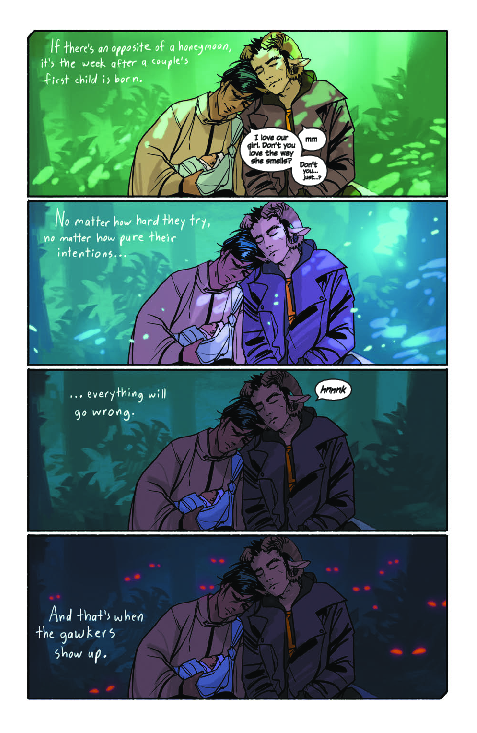
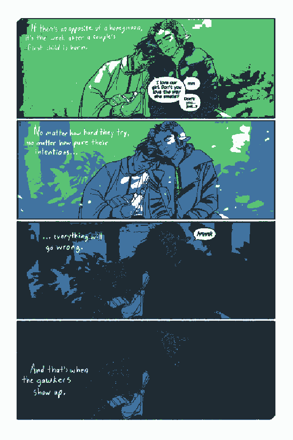
For example, let’s take this page from Saga:
Saga uses a ton of colors, and I wanted to capture that somehow. I started out trying to find the average color of each page. What would it look like if you took all of the colors from the page and mixed them together?
The “algorithm” for this is pretty simple: take each pixel in the image and break it down into the red, green, and blue components of the RGB color at that pixel. Add each of those R, G, B values to a total, and at the end divide the total by the number of pixels in the image. The average color for the above page turns out to be this:

This makes sense, which is always a good start- most projects like this begin with a “wait what?” moment. This color is a result of mixing the bright greens and blues in the top half of the image with the darker colors in the bottom half of the image.
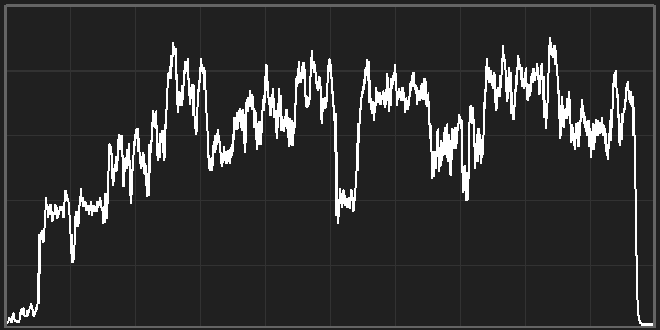
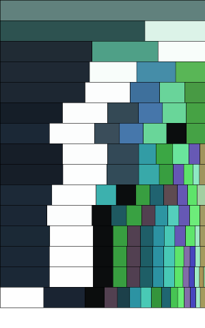
From here, it’s not too hard to automatically generate the average color for the first 100 pages of Saga:

Here, each rectangle is the average color of a single page. We can see that Saga uses a bunch of different colors.
We can also see how each issue / chapter has its own distinct color flow- in this case, each white square is the end of a chapter. For example the first chapter starts out with a lot of lighter browns and yellows, until it gets to this page:
This is the first black rectangle in the above averages grid. This is one way Fiona Staples (Saga’s artist) uses color to tell the story: for the first 20 or so pages, your eyes become used to the light browns and yellows, so the sudden transition to a mostly-black page provides a juxtaposition that makes you stop and look more carefully at this page. This particular page explains the origins of the war that’s central to the story of Saga, so the colors (not to mention the difference in layout) encourage you to spend more time here.
I could ramble about the art in comic books for hours, but I’ll resist that urge to move on to the next interesting part of this project, which was comparing the averages of one comic to the averages from another comic. Here’s the average color of the first 100 pages of East of West:

This tells a much different story than the colors of Saga. Where Saga uses a lot of different colors, East of West has a pallete that contains of a mix of white, red, and black. This averages out to be a lot of red-browns.
Here’s Invincible:

Similar to Saga, Invincible uses a lot of different colors. But where Saga frames its colors with darker backgrounds (which makes the averages darker), Invincible uses a lot of lighter backgrounds, so the averages are brighter as well. I’m not a color-ologist, but I’d guess that this is part of why Invincible feels a little more playful than the others, which feel a little… edgier (?) to me.
And here’s Fatale:

Fatale is much darker and more monotone on average, which makes sense for a noir comic about crime, murder, and demons.
Color Clusters
The averages were super interesting to me, but I knew they didn’t tell the full story. Comics contain a bunch of different colors, usually split between background colors and foreground colors. There are usually a couple colors that the human eye picks up on as the most noticeable colors on a page. Taking the average of every color glosses over this, and you lose information in the process.
So I wanted to come up with an algorithm that returned the “core” colors of a page. If a page was a pink character on a black background, I wanted to identify pink and black instead of just an average of pink-ish black.
I thought about using background subtraction, but eventually I settled on k-means clustering.
K-means clustering lets you take data like this:

Where you have a bunch of points, and group them into a certain number of clusters. You can say “group these into two clusters” and the k-means algorithm will tell you which cluster each of your points belongs to:

If we treat our R,G,B colors as X,Y,Z points, then we can apply k-means to the colors to cluster them into groups. We can then take the average of each of those groups to come up with representative colors for the page.
For example, here is what we get when we group that first page from Saga into 4 colors:

This shows that the page is mostly black (actually it’s a really dark blue), with a lot of white (the spaces between the panels count), and some green and lighter blue.
Here’s what the original image looks like using a pallete made up of the representative colors:
This isn’t exactly perfect, but from a data visualization perspective it’s better than the color average.
I thought about different ways of using the cluster data in the final visualization. Here, each row of colors represents a different number of clusters. The first row is 1 cluster, the second row is 2 clusters, etc:
This was a lot of fun to play with, but it was pretty messy, especially if I wanted to show a bunch of pages all at once.
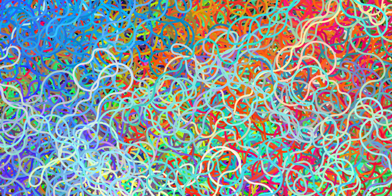
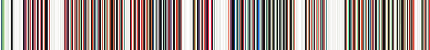
Eventually I came up with something pretty similar to the inspiration for this project: I clustered each page into 4 colors, and drew a line for each color. So the first 100 pages of Saga looks like 400 lines of colors:

This lets the viewer scan through all 100 pages, pick up on the main colors of each page, and identify interesting trends throughout the issues. Success!
Here’s East of West:
And here’s Invincible:
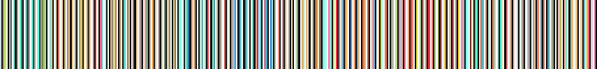
And just for fun, here’s Walking Dead:
Putting it All Together
Now that I had my visualizations, I just had to put it together into an interactive tool. I generated all of the images and then used P5.js to put together this tool.
Try it out! What trends do you see? Want to see any other comics? Post about it in the forum!
Are you a comic book artist interested in playing around with this stuff? Contact me!