


Movie Colors
This project uses Processing to visualize movie colors in a few different ways.
What effect does color have on us? What does it mean for a movie to use more of one color than another? Or to jump between a bunch of different colors? I don't really know the answer to those questions, but I think it's interesting to look at!
Many of these are available as posters on Etsy.
Here is an explanation of the different visualizations:
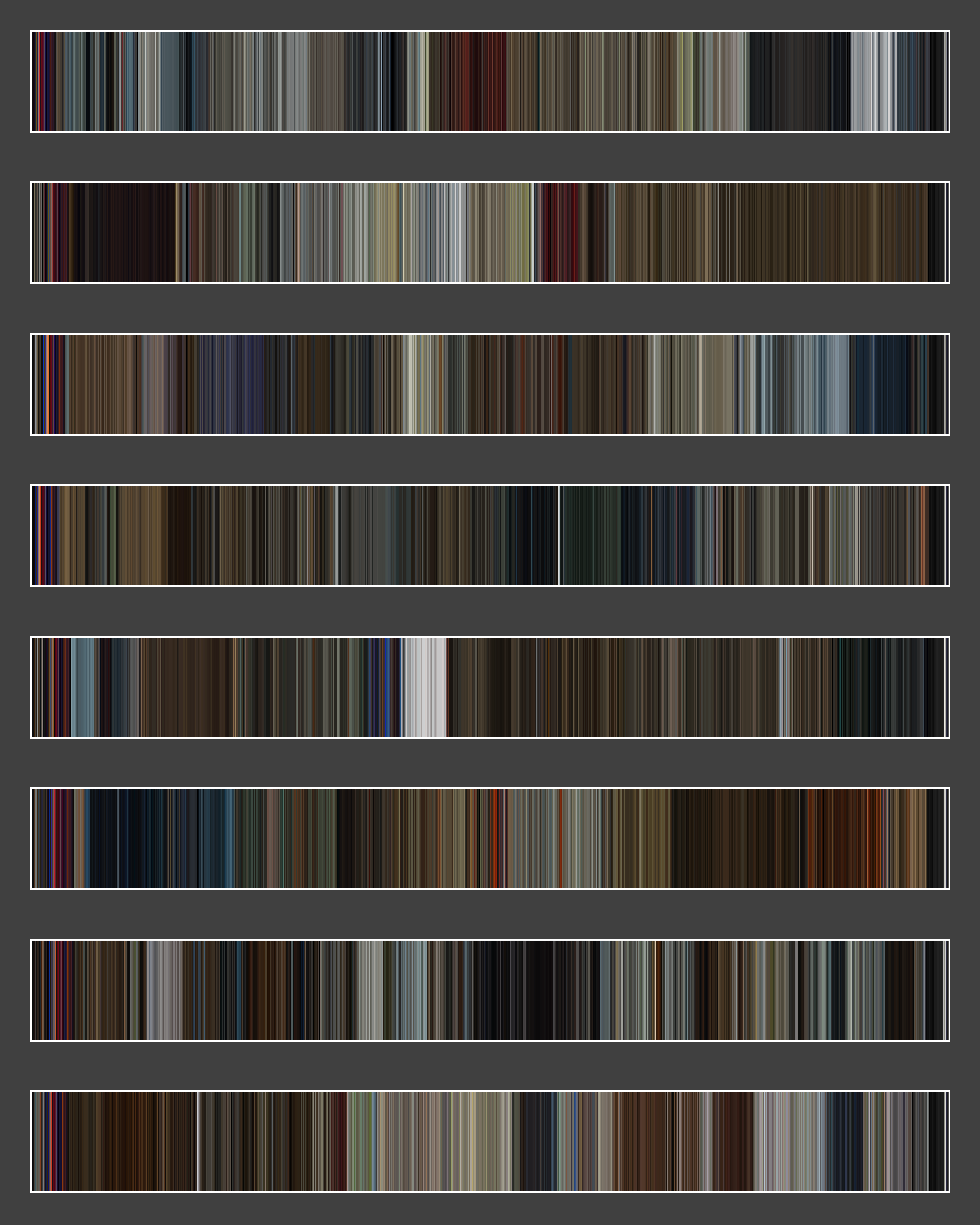
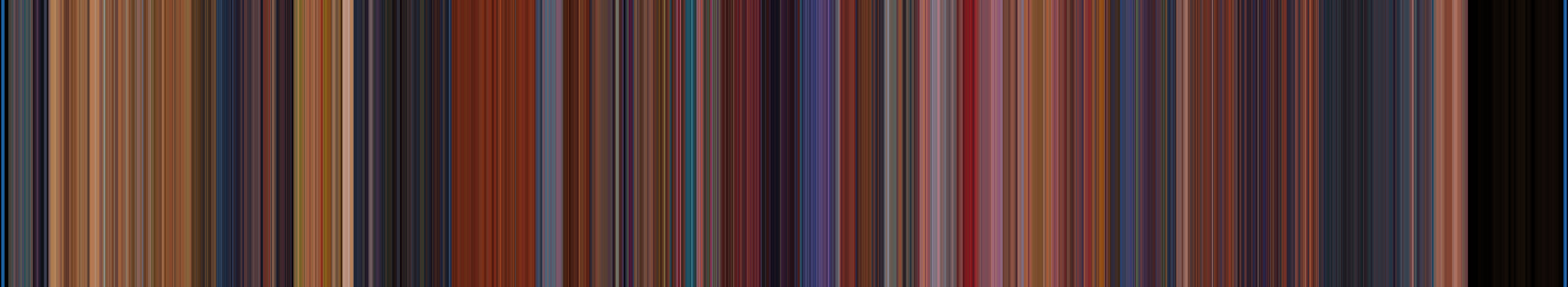
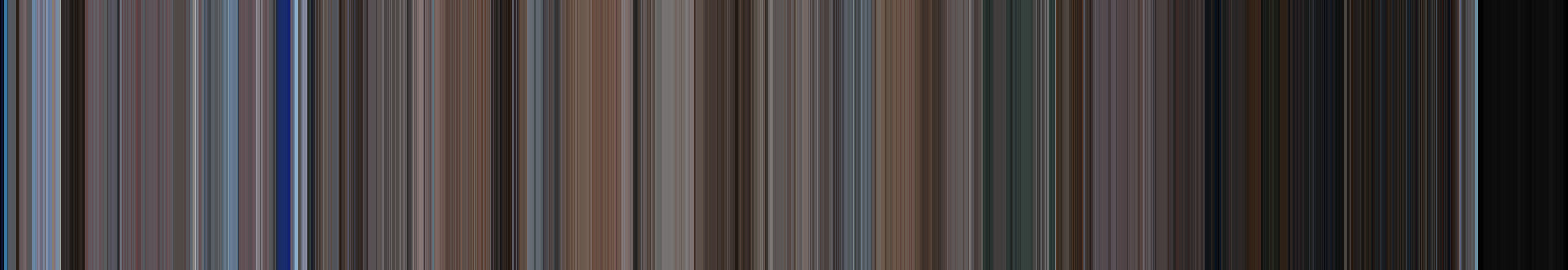
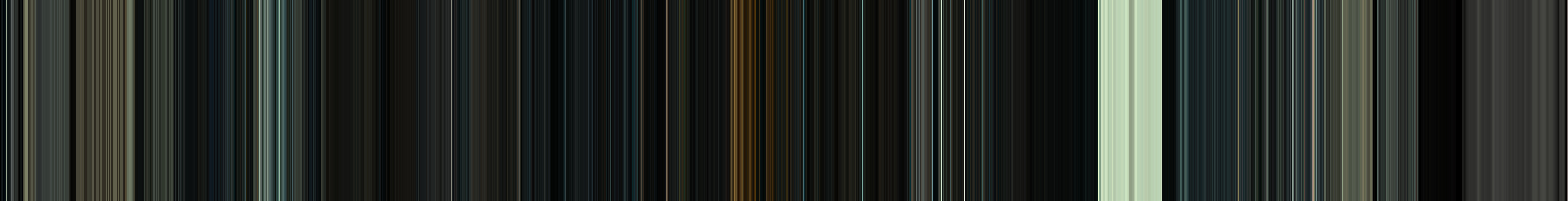
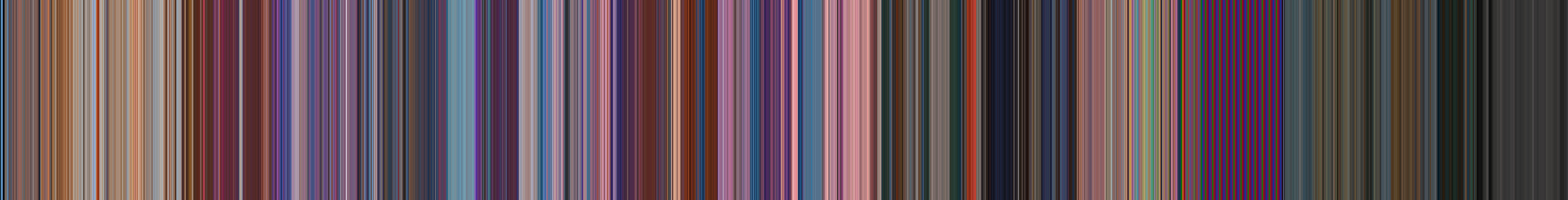
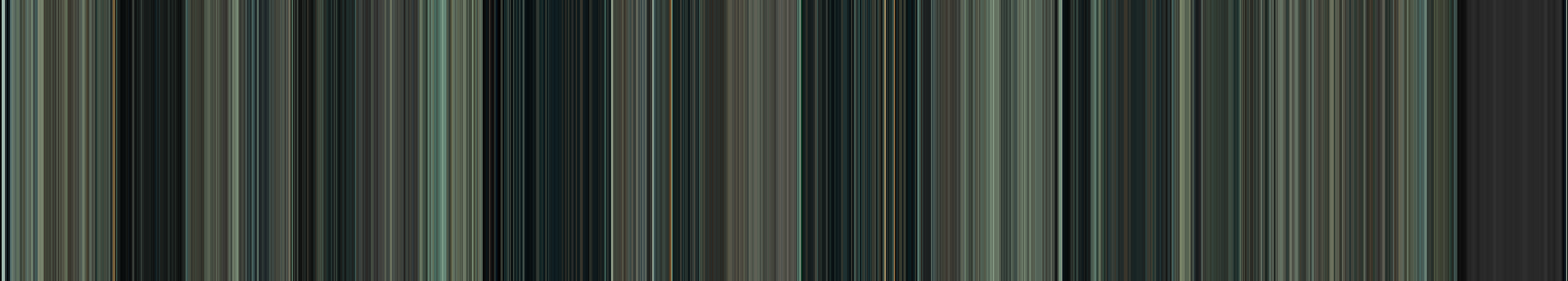
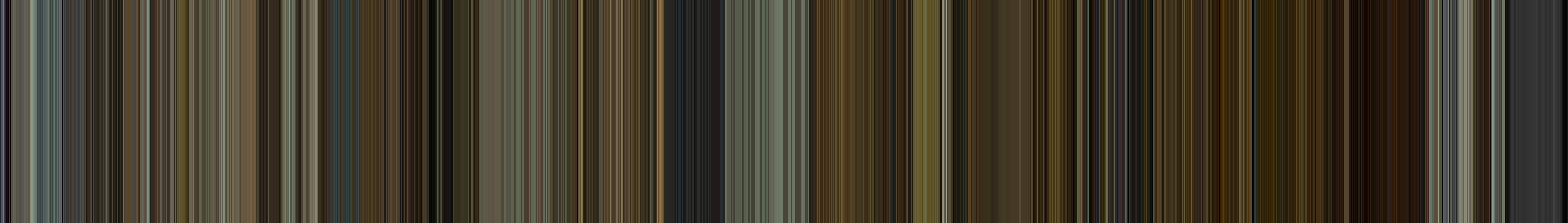
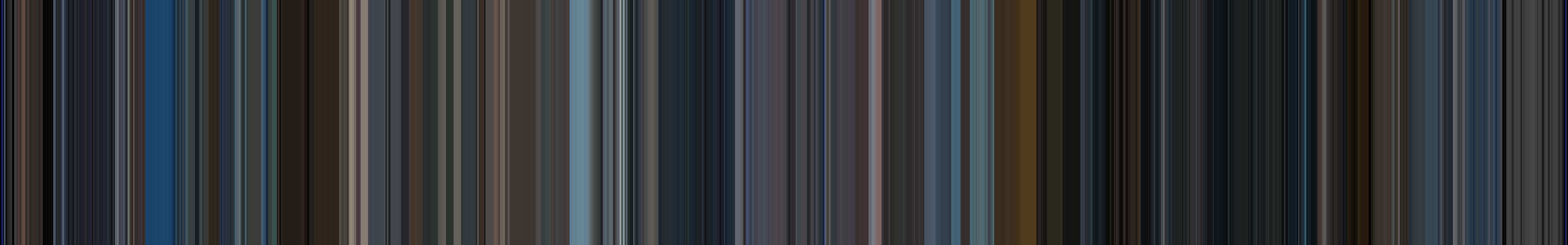
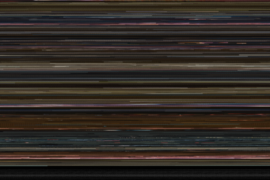
Timelines

Each vertical line is a one-second slice of the movie. The color of each line is the average color of that one-second slice. Click it to see a bigger version.
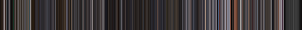
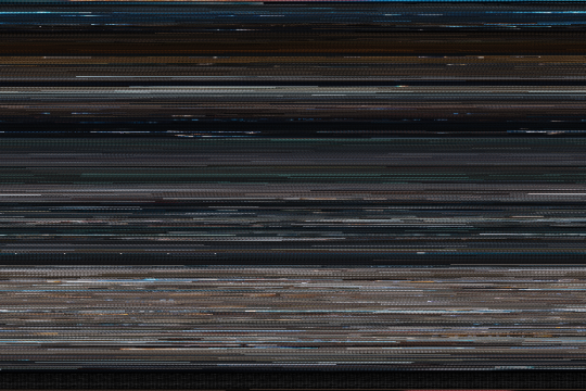
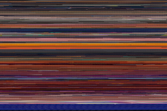
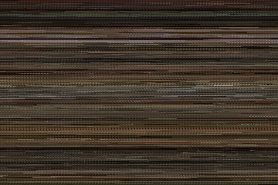
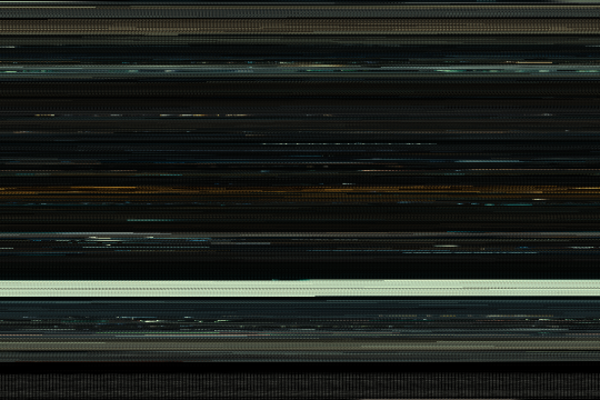
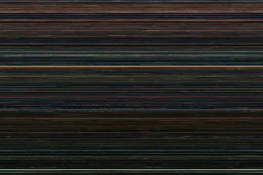
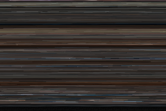
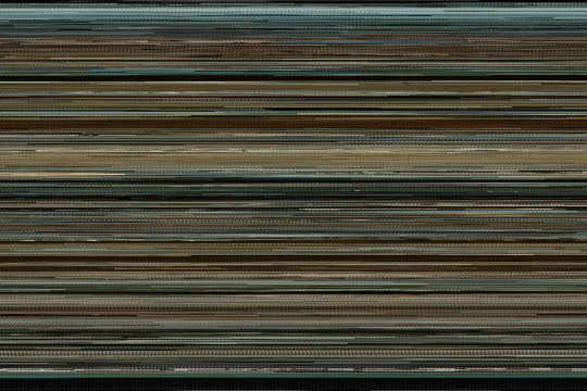
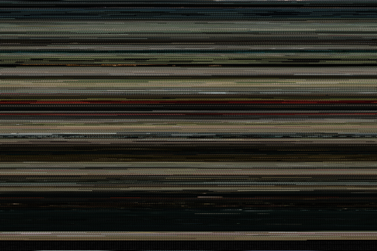
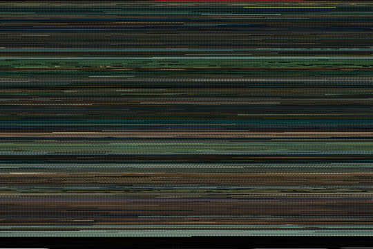
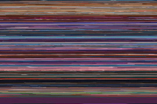
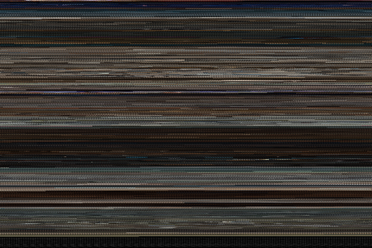
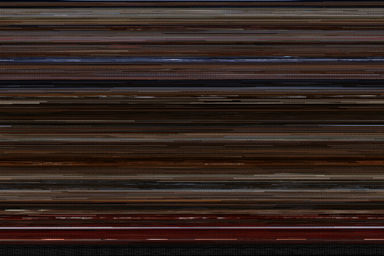
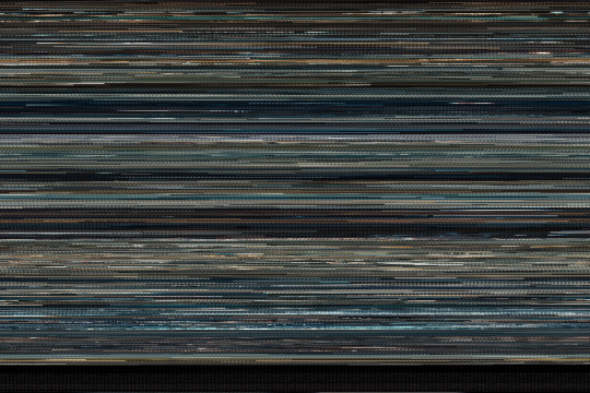
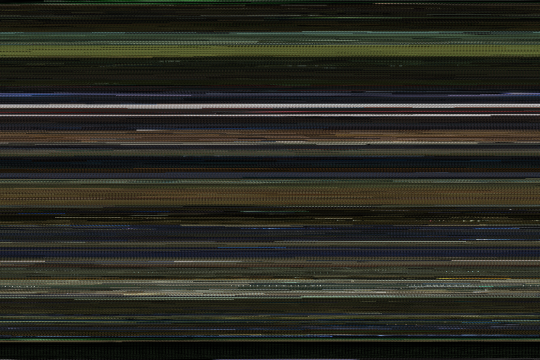
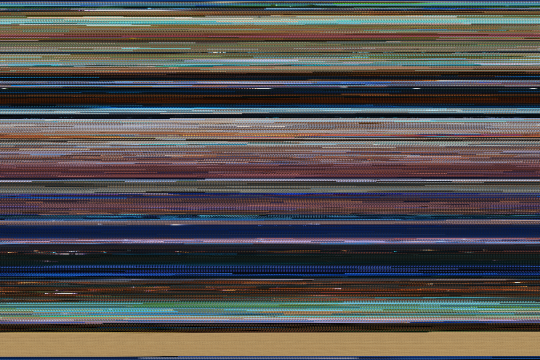
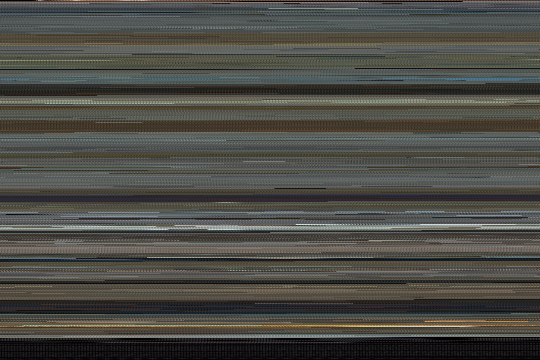
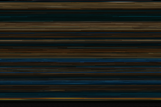
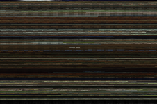
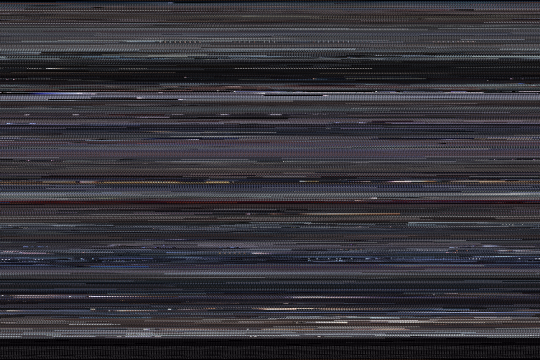
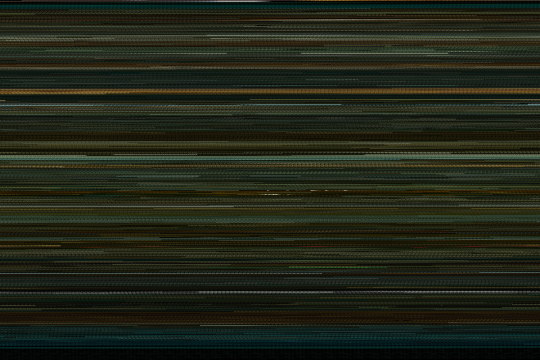
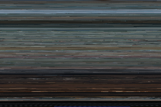
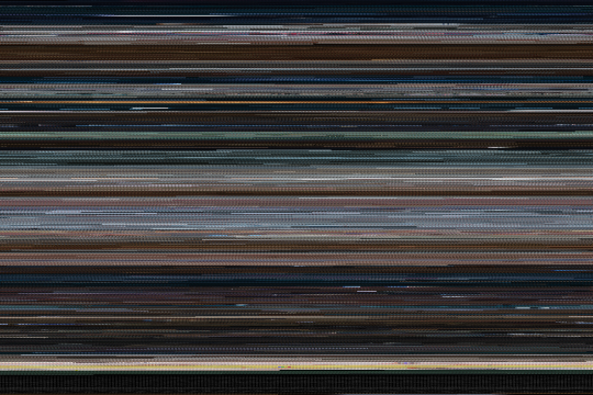
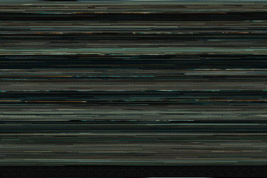
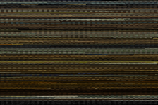
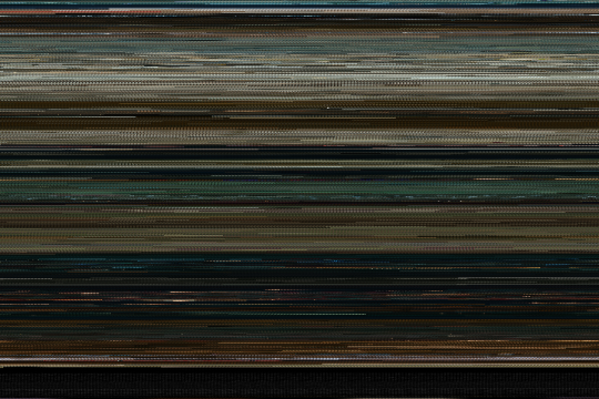
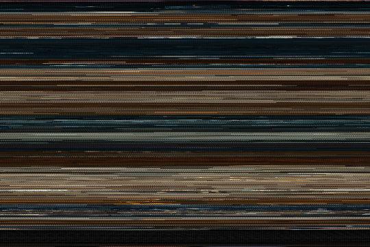
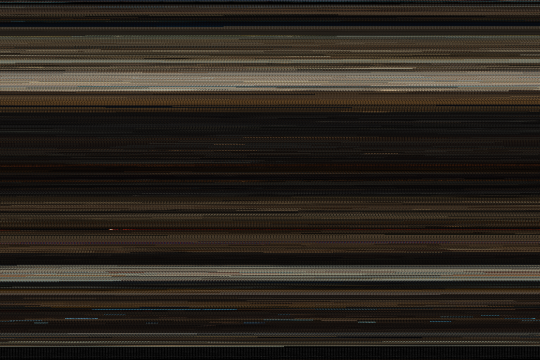
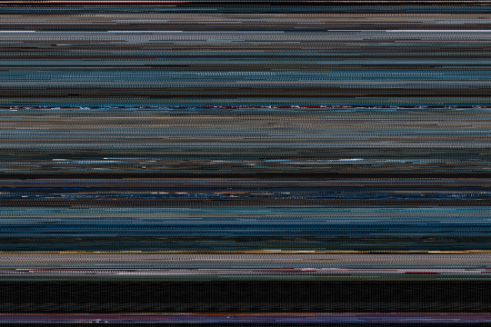
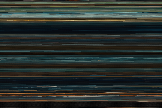
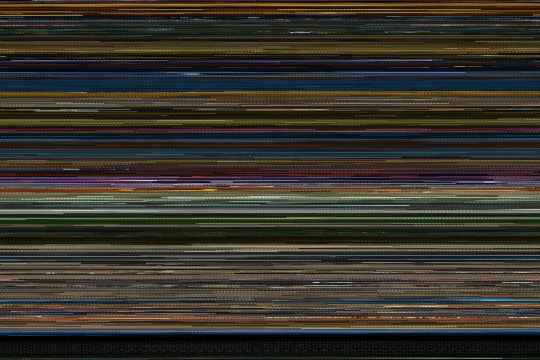
All Frames
These images contain every single frame from a movie. (Most movies have 24 frames per second!) Each individual frame is too small to see, but the overall colors from the movie make an interesting pattern.
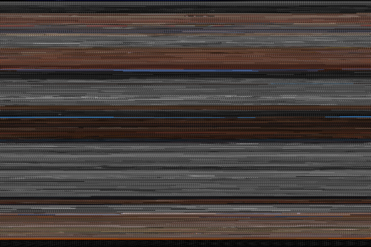
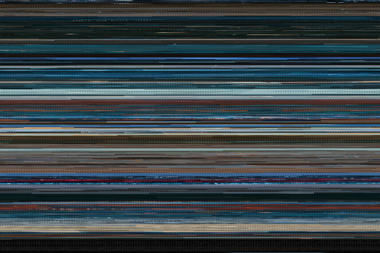
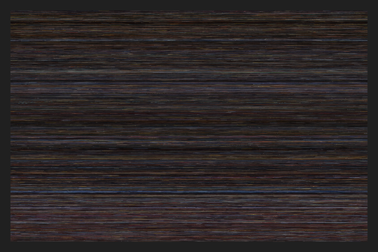
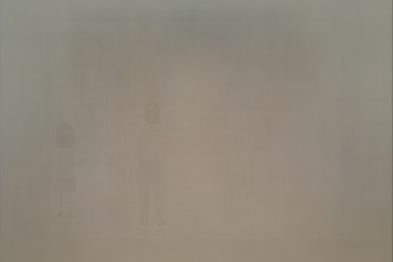
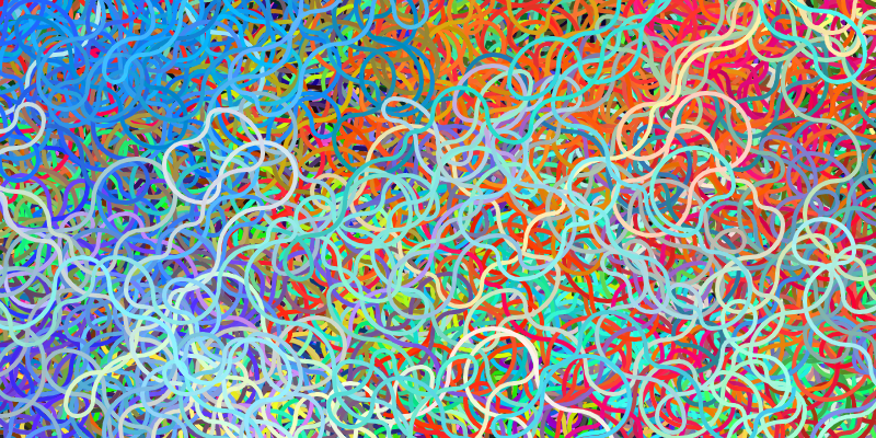
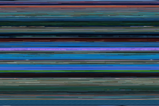
Averages
A multiple exposure is created by overlapping multiple pictures on top of each other:

These images are a result of overlapping every frame of a movie into a single image:

If you look closely, you'll see a pattern similar to screen burn-in formed by common elements of the movie. (This example is from Finding Nemo- do you see anything familiar?)