Bootstrap


Bootstrap
- Bootstrap
- Bootstrap CSS
- Bootstrap JavaScript
- Bootstrap Components
- Custom Styling
- Bootstrap Pros and Cons
- Homework
Now you know how to use HTML to create a webpage, how to style it with CSS, and how to make them interactive using JavaScript. You’ve also learned about JavaScript libraries, which let you use code written by other people.
This tutorial introduces Bootstrap, which is a JavaScript library and a set of CSS styles you can use in your own webpages.
Bootstrap
Bootstrap is really two things:
- It’s a bunch of predefined CSS you can use to style your webpage.
- It’s a JavaScript library that makes your webpage interactive.
To use Bootstrap, load both the Bootstrap CSS and the Bootstrap JavaScript library:
<link href="https://cdn.jsdelivr.net/npm/bootstrap@5.3.3/dist/css/bootstrap.min.css" rel="stylesheet">
<script src="https://cdn.jsdelivr.net/npm/bootstrap@5.3.3/dist/js/bootstrap.bundle.min.js"></script>
Now that you’ve loaded the CSS and the JavaScript, you can use both in your page. Let’s talk about them one at a time:
Bootstrap CSS
By now you know that you can style your webpage using CSS. You create a .css file that contains style rules, and then you use those style rules by setting the id and class attributes of your html elements.
Bootstrap provides a .css file with a bunch of style rules that you can use to style your webpage.
For example, look at this page that contains unstyled content:
See the Pen by Happy Coding (@KevinWorkman) on CodePen.
I’ve set the class attribute of some of these elements, but I haven’t written any styles for those classes, so everything has the default styling. At this point I could write a .css file that styles the content. Or I could use the .css file that Bootstrap provides!
See the Pen by Happy Coding (@KevinWorkman) on CodePen.
The only thing that changed is I’ve added the Bootstrap CSS file (and the Bootstrap JavaScript, which doesn’t do anything yet). In that CSS, Bootstrap contains styles for the classes I used.
The payoff is I get a reasonably nice-looking webpage, without needing to write any CSS myself.
Bootstrap JavaScript
The other half of Bootstrap is its JavaScript library, which contains objects and functions that let you create interactive elements. This is usually done automatically based on the class attributes in your page, so you usually don’t have to write any JavaScript yourself.
Let’s start with the HTML, without loading Bootstrap:
See the Pen by Happy Coding (@KevinWorkman) on CodePen.
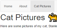
This HTML contains a <div class="dropdown"> element, which contains a <button> and a <ul> list. Without Bootstrap, those elements are not interactive, and certainly don’t show a dropdown.
But if you add Bootstrap:
See the Pen by Happy Coding (@KevinWorkman) on CodePen.
The HTML itself has not changed, but now the code loads Bootstrap’s CSS and JavaScript. Bootstrap’s CSS styles the elements to look like a dropdown, and Bootstrap’s JavaScript automatically adds a click listener to the <button> to toggle the visibility of the list when it’s clicked.
The power of Bootstrap is that you didn’t have to write any of that CSS or JavaScript yourself. You get the functionality and a reasonable look-and-feel by including the Bootstrap CSS and JavaScript and using the corresponding classes on your HTML elements.
Bootstrap Components
Now that you know Bootstrap is both CSS and JavaScript that responds to certain CSS classes, the next question is: how do you know what CSS classes to use to trigger the correct behavior? If you’ve been reading the rest of these tutorials, you can probably guess by now that the answer is: consult the documentation!
The Bootstrap documentation contains a bunch of example components (like the dropdown from above) that you can use. If you’re interested in using Bootstrap, this page should be your first stop. I recommend reading through that whole thing at least once, and then going back to it later when you need a specific component.
W3Schools also has a good section of Bootstrap examples. And of course search engines are always your best friend.
Here are a couple examples of the most common Bootstrap components:
Container
The container class lets the content in your website “snap” to certain widths depending on the device you’re using and the width of the window.
Here’s an example:
See the Pen by Happy Coding (@KevinWorkman) on CodePen.
Try opening this code up in its own window and then changing the width of the window to see the container “snap” to different widths. This lets you create a responsive webpage without worrying about any styling yourself.
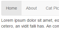
Navigation
To create a navigation bar, you can use a <nav> tag with the navbar class, then a <ul> tag with the navbar-nav class.
See the Pen by Happy Coding (@KevinWorkman) on CodePen.
(The navigation bar is automatically turned into a vertical menu if it doesn’t have enough width, so try opening this in a new window.)
From here you can do fancier things like putting different types of components inside your nav, or changing how your navigation works on mobile devices. Check out Bootstrap’s documentation for more info!
Grid
Bootstrap contains a grid layout system that lets you organize your content using the row and col classes.
By default, each row takes up 100% of the container width, and then each column in a row takes up an equal share of the row’s width.
Here’s an example with four rows, each with a different number of columns.
See the Pen by Happy Coding (@KevinWorkman) on CodePen.
Within each row, each column takes up an equal share of the available width.
Bootstrap divides each row into 12 “template columns”, and by default, the col class will take up an equal share of those 12 template columns. But you can change that by using the col-N classes, where N is a number between 1 and 12. Here’s an example:
See the Pen by Happy Coding (@KevinWorkman) on CodePen.
Now each row has columns that take up different amounts of template columns. Here are a couple things to notice:
- The first row contains a single column that only takes up 3 template columns. The rest of the row is empty.
- The second row contains a column that takes up 2 template columns, and then another template that takes up the remaining template columns.
- The third row contains a column that takes up 6 template columns, which is half of the available width, then 2 other columns that each take up half of the remaining width.
- The fourth row contains 4 columns, each which take up a different number of template columns. Try adding another column to this row. What happens if the next column has
col-6?
You can use Bootstrap’s grid layout to organize your page into sections. Here’s an example:
See the Pen by Happy Coding (@KevinWorkman) on CodePen.
This page splits the page up into three columns: one for the left nav, one for the main content, and another for the right nav.
Check out Bootstrap’s grid documentation for other examples, including using different layouts on different screen sizes.
Custom Styling
As you’ve seen, Bootstrap provides its own CSS styles. But you aren’t stuck with the default styles that Bootstrap provides.
You can add your own CSS rules for any Bootstrap class to create your own custom style. Keep in mind the cascading part of CSS, which means that your styles will be combined with the styles from the main Bootstrap CSS.
See the Pen by Happy Coding (@KevinWorkman) on CodePen.
This example uses Bootstrap for most of the styling, but adds some custom styling in its own <style> tag. These styles then cascade on top of Bootstrap’s styles to create the end result.
This gives you the best of both worlds: you get to use all of the styles from Bootstrap, but you still get to customize your site with whatever styles you want.
Themes
Another feature of Bootstrap is the availability of themes, which are alternative CSS files that style Bootstrap’s classes.
To use a theme, instead of loading Bootstrap’s default .css file, you load a different .css file that define styles for Bootstrap’s classes. These files are called Bootstrap themes, but really they’re regular .css files.
Here’s an example page that uses Bootstrap’s default styles, aka the default theme:
See the Pen by Happy Coding (@KevinWorkman) on CodePen.
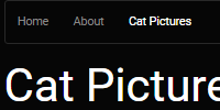
And here is that same page using the Cyborg Theme from Bootswatch:
See the Pen by Happy Coding (@KevinWorkman) on CodePen.
Notice that the only thing that really changed is the .css file that’s loaded in the <head> section. This .css file defines all of the classes that Bootstrap uses, but with different styles than the default .css file. You can download the .css file or view it in your browser here: https://bootswatch.com/5/cyborg/bootstrap.css
Try doing a search in that file for the card class to see the styles on it.
Bootstrap Pros and Cons
I originally wrote this tutorial back in January of 2017. Back then, I was personally using Bootstrap to style Happy Coding. But since then, I’ve grown to prefer writing my own CSS. A little CSS goes a long way (warning: that page contains swears), without needing to rely on Bootstrap!
Even though I don’t really use Bootstrap myself anymore, I’ve decided to keep this tutorial up (and to continue teaching Bootstrap) for a couple reasons:
First, it’s still really popular. You’re pretty much guaranteed to encounter Bootstrap as you’re learning how to create webpages, so I wanted to introduce it along with the other concepts you’ve been learning about. My hope is that I helped demystify bootstrap. It’s not magic! At the end of the day, it’s the same HTML, CSS, and JavaScript that you’ve already been using.
Second, and most importantly, I wanted to introduce the concept of using a frontend framework. There are a ton of frameworks out there, and Bootstrap is just one of them. So more important than using Bootstrap specifically, I wanted to show you the more general process of using a framework, consulting documentation, and trying things out. If you continue learning more about web development, you’ll almost certainly encounter other frameworks along the way, and hopefully being exposed to Bootstrap will make them a little easier to understand.
All of that said, you shouldn’t feel like you need to use Bootstrap to create a webpage!
Homework
- Use Bootstrap to style your personal webpage. Add some Bootstrap components, like a collapsing navbar or a carousel of images!
- Keep your eyes peeled for websites that use Bootstrap. Once you start looking, you’ll see them everywhere.